

10 Essential Website Design Best Practices for 2025
In today's competitive marketplace, your website serves as the primary point of contact between your brand and potential customers. It is no longer just a digital brochure; it functions as your virtual storefront, a critical sales channel, and the very core of your online identity. An underwhelming design does more than just appear unprofessional; it actively erodes user trust, damages your search engine rankings, and directly impacts your financial performance. To succeed, businesses must adopt website design best practices that extend beyond simple aesthetics, focusing instead on a holistic approach that prioritises user experience, technical performance, and inclusivity.
This comprehensive guide moves past generic advice to provide a detailed breakdown of ten essential principles for modern web design. We will explore actionable strategies for creating a website that not only captures attention but also functions seamlessly to engage visitors and convert them into loyal customers. You will learn how to implement everything from mobile-first responsive design and rapid page load speeds to intuitive navigation and robust accessibility standards. Each practice is designed to be a foundational element, empowering you to build a digital presence that is not just visually appealing but is engineered for tangible business growth. By mastering these core concepts, you can ensure your website serves as a powerful asset that drives engagement and delivers measurable results.
1. Mobile-First Responsive Design
One of the most crucial website design best practices today is adopting a mobile-first approach. This strategy flips traditional design on its head; instead of creating a desktop website and then shrinking it for smaller screens, you start by designing for the smallest screen first (typically a mobile phone) and then progressively enhancing the layout for tablets and desktops. This ensures the core functionality and user experience are optimised for the majority of users, as mobile browsing continues to dominate global internet traffic.
This methodology, popularised by pioneers like Luke Wroblewski and supported by Google's mobile-first indexing, forces designers to prioritise essential content and features from the outset. By focusing on mobile constraints first, you create a cleaner, more focused, and faster-loading experience that scales up gracefully, rather than a cluttered desktop version that struggles to function on a smaller device.

Why Mobile-First Matters
The primary benefit is an improved user experience on mobile devices, which directly impacts engagement and conversion rates. A site designed for mobile is inherently faster and more accessible. Furthermore, since Google primarily uses the mobile version of a site for indexing and ranking, a mobile-first approach is fundamental for strong SEO performance. Brands like Spotify and Airbnb excel at this, offering a consistent and intuitive interface whether you are on their app or desktop site.
Actionable Implementation Tips
To effectively implement mobile-first responsive design, follow these key steps:
- Start Small: Begin your design process with a base screen width of 320px to cater for the smallest common mobile devices.
- Use Relative Units:
Employ relative units like
rem,em, and percentages (%) for fonts and container widths instead of fixed pixels. This allows your layout to adapt fluidly to different screen sizes. - Prioritise Content: Identify the most critical content and calls-to-action that a mobile user needs. Eliminate non-essential elements to reduce clutter and improve loading times.
- Focus on Touch: Ensure all interactive elements like buttons and links have a minimum touch target size of 44x44 pixels to prevent user frustration.
- Test on Real Devices: While browser emulators are useful, always test your design on a range of actual mobile phones and tablets to identify real-world performance and usability issues. This is a vital step often overlooked in the website development process.
2. Fast Page Load Speed Optimisation
In the world of digital experiences, speed is not just a feature; it's a fundamental expectation. Fast page load speed optimisation is one of the most critical website design best practices you can implement. The goal is to ensure your website loads for users in under three seconds, as anything longer dramatically increases the bounce rate. This involves a multi-faceted approach of reducing file sizes, optimising server responses, and leveraging browser caching to deliver content almost instantaneously.
This discipline, championed by web performance pioneers like Steve Souders and heavily emphasised by Google's Core Web Vitals initiative, directly correlates to user satisfaction and business success. A slow website frustrates visitors, harms your brand's reputation, and negatively impacts conversion rates. Conversely, a snappy, responsive site delights users, encourages longer engagement, and provides a significant competitive advantage.
The bar chart below illustrates the tangible business impact of speed improvements, drawing from real-world case studies of major online brands.
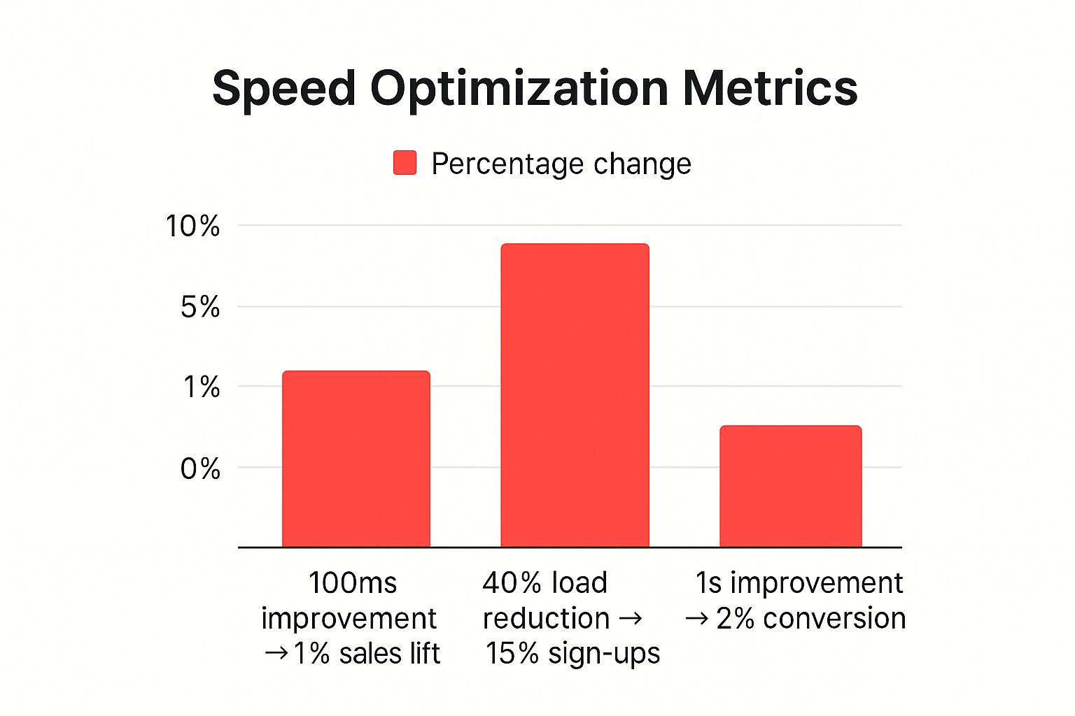
As the data clearly shows, even fractional-second enhancements in load time can lead to substantial gains in key business metrics, from sales to user sign-ups.
Why Page Speed Matters
The primary benefit is a vastly improved user experience, which is the cornerstone of high conversion rates and customer loyalty. Real-world examples prove this: Amazon famously calculated a 1% sales increase for every 100ms of speed improvement, while Walmart saw a 2% conversion increase for every one-second improvement. Furthermore, page speed is a confirmed ranking factor for Google, meaning a faster site is more likely to secure a higher position in search results, driving more organic traffic.
Actionable Implementation Tips
To effectively optimise your site's loading speed, focus on these high-impact actions:
- Optimise Images: Use modern image formats like WebP or AVIF which offer superior compression and quality compared to traditional JPEGs and PNGs. Always compress images before uploading.
- Enable Gzip Compression: Configure your server to use Gzip compression, which significantly reduces the size of your HTML, CSS, and JavaScript files before they are sent to the browser.
- Minimise HTTP Requests: Reduce the number of individual files a browser has to request by combining CSS and JavaScript files where possible. Each request adds overhead and slows down the page load.
- Leverage Browser Caching: Configure your server to set longer expiry dates for static assets like images, CSS, and JS. This allows the user's browser to store these files locally, speeding up subsequent page visits.
- Use Performance Tools: Regularly analyse your site using tools like Google PageSpeed Insights or GTmetrix to identify specific bottlenecks and receive actionable recommendations for improvement.
3. Intuitive Navigation Structure
Another cornerstone of effective website design best practices is crafting an intuitive navigation structure. A logical, well-organised navigation system acts as a roadmap, allowing users to effortlessly find information and move through your website without confusion or frustration. The goal is to make the journey from entry point to desired content as seamless as possible, a principle famously championed by usability expert Steve Krug in his book, Don't Make Me Think.
Effective navigation adheres to established web conventions, maintains consistency across all pages, and uses a clear visual hierarchy to guide the user's eye. When users can predict where to find what they are looking for, they feel more in control, which builds trust and encourages them to explore your site further. This clarity is fundamental to a positive user experience and directly impacts user retention and conversion rates.
Why Intuitive Navigation Matters
A confusing navigation is one of the quickest ways to lose a potential customer. If users can't find what they need, they will simply leave. Clear navigation improves key metrics like session duration and pages per visit while reducing bounce rates. Companies like Apple exemplify this with minimalist navigation focused on key product categories, while Amazon's comprehensive mega-menu system successfully organises thousands of products into logical, accessible pathways.
Actionable Implementation Tips
To develop a user-centric navigation system, integrate these practical steps:
- Follow the 'Three-Click Rule' : Aim to make all important information accessible within three clicks from the homepage. This forces you to prioritise and structure content efficiently.
- Use Familiar Patterns : Stick to conventional navigation layouts (e.g., top horizontal bar for desktops) and use clear, common terminology. Avoid jargon or clever labels that might confuse users.
- Implement Hamburger Menus Thoughtfully : While standard on mobile, ensure the hamburger menu is easily discoverable and organises links logically. For desktop, visible navigation links are almost always preferable.
- Include a Sitemap : For large or complex websites, a sitemap in the footer provides a complete overview and a secondary way for users and search engines to find content.
- Test with Real Users : Conduct card sorting exercises or usability testing to understand how your audience naturally groups information. This user feedback is invaluable for creating a truly intuitive structure.
4. Clean, Readable Typography
Often overlooked yet fundamentally important, typography is the art of arranging text to be legible, readable, and appealing when displayed. This essential element of website design best practices involves the strategic selection of fonts, font sizes, line spacing, and text hierarchy. Good typography makes your content effortless to consume, reinforces your brand's identity, and significantly improves the overall user experience by guiding the reader's eye.
This discipline, championed by typographers like Erik Spiekermann and Matthew Carter, is about more than just choosing a nice font. It is a core component of user interface design that serves both functional and aesthetic purposes. When executed well, it creates a clear visual hierarchy that helps users navigate your site and absorb information efficiently, turning words into an elegant and effective communication tool.
Why Clean Typography Matters
The primary benefit of strong typography is enhanced readability, which reduces user friction and encourages longer engagement with your content. A well-structured typographic system makes your design look more professional and organised, building trust and credibility with your audience. Brands like The New York Times and Medium are excellent examples; their sophisticated use of fonts and spacing makes reading long-form articles a pleasure, demonstrating how typography can define a digital experience. Similarly, Mailchimp’s friendly font choices make its interface feel approachable and easy to use.
Actionable Implementation Tips
To effectively implement clean and readable typography, focus on these key steps:
- Choose Versatile Fonts: Select a maximum of two or three font families that are easy to read on screens. Use reliable services like Google Fonts to ensure consistent rendering across all browsers.
- Establish a Clear Hierarchy: Use distinct font sizes, weights (e.g., bold, regular), and colours to differentiate between headings, subheadings, and body text. This guides the user through the content logically.
- Optimise Line Measures: Aim for a line length of 50-75 characters for body text. Lines that are too long or too short can strain the reader's eyes and disrupt reading flow.
- Manage Spacing:
Pay close attention to
line-height(leading) and the space between paragraphs. Adequate white space prevents text from feeling cramped and improves legibility. A good starting point for line height is 1.5 times the font size. - Test Across Devices: Always check how your typography looks on various screen sizes and resolutions. What appears perfect on a desktop might be unreadable on a small mobile device.
5. Strategic Use of White Space
Often misunderstood as "empty" space, white space (or negative space) is a fundamental element in exceptional website design best practices . It refers to the unmarked areas between and around design elements like typography, images, and buttons. Far from being wasted, white space is an active tool that guides the user's eye, reduces cognitive load, and creates a sense of elegance and focus, making content more digestible and visually appealing.
This principle, rooted in the minimalist philosophies of designers like Dieter Rams and the Swiss Design movement, is about creating balance and hierarchy. By giving elements room to breathe, you improve readability and comprehension, drawing attention to the most important parts of your page, such as a call-to-action. It is the art of using nothing to enhance everything.
Why White Space Matters
The primary benefit is a massive improvement in user experience. A clean, uncluttered layout feels more professional, trustworthy, and is significantly easier to navigate. This directly impacts user engagement and can increase conversion rates by making key actions clearer. Brands like Apple master this, using generous white space on their product pages to create a premium feel and focus all attention on the product itself. Similarly, Google’s famously minimalist homepage proves that less is often more effective.
Actionable Implementation Tips
To effectively implement strategic white space, consider the following key steps:
- Adopt a Grid System: Use a consistent spacing system, such as an 8px grid. Define margins and padding in multiples of 8 (e.g., 8px, 16px, 24px) to create a harmonious and organised rhythm throughout your design.
- Increase Line Spacing: For body text, set your line-height to approximately 1.5-1.6 times the font size. This simple adjustment dramatically improves readability and reduces eye strain for users reading long blocks of text.
- Group Related Elements: Use the principle of proximity. Place related items closer together and use larger gaps of white space to separate them from unrelated groups. This creates a clear visual hierarchy without needing extra lines or boxes.
- Emphasise Calls-to-Action: Surround your primary buttons and CTAs with ample negative space. This makes them stand out from the surrounding content, naturally drawing the user's eye and encouraging clicks.
- Resist Filling Every Gap: The most important tip is to fight the urge to fill every pixel. Trust that the empty space is working hard to improve your design’s clarity, focus, and overall aesthetic.
6. Consistent Visual Branding
A cornerstone of effective website design best practices is maintaining consistent visual branding. This principle involves the unified application of colours, fonts, imagery, and design elements across every page of your website to cultivate a cohesive and memorable brand experience. It ensures that no matter where a visitor lands on your site, they instantly recognise they are interacting with your brand.
This systematic approach, championed by design legends like Paul Rand and Massimo Vignelli, transforms a website from a simple collection of pages into a powerful communication tool. Consistent branding builds recognition, fosters trust, and conveys professionalism, reinforcing your brand's values and personality at every digital touchpoint. It’s the visual thread that ties the entire user journey together.
Why Consistent Branding Matters
The primary benefit is building brand equity and user trust. When visual elements are predictable and coherent, users feel more secure and can navigate more intuitively. This consistency directly impacts perception, making your brand appear more stable and reliable. Furthermore, a strong visual identity differentiates you from competitors and makes your brand instantly recognisable in a crowded market. Brands like Coca-Cola, with its iconic red, and Spotify, with its distinctive green accent and rounded UI, master this by ensuring their digital presence is always on-brand.
Actionable Implementation Tips
To effectively implement consistent visual branding, follow these key steps:
- Create a Style Guide: Develop a comprehensive style guide or design system that documents your brand's colours, typography, logo usage, spacing, and component styles. This is the single source of truth for your design team.
- Use CSS Variables: Employ CSS variables or pre-processors (like Sass) to define your brand’s core colours, fonts, and spacing values. This makes it simple to apply and update styles globally, ensuring consistency.
- Maintain a Component Library: Build a library of reusable UI elements like buttons, forms, and cards. This not only ensures visual consistency but also dramatically speeds up the website development process.
- Regularly Audit Your Site: Periodically review your website to identify and correct any inconsistencies that may have emerged over time. Automated visual regression testing tools can help with this.
- Train Your Team: Ensure everyone involved in creating content or developing features for the website understands and has access to the brand guidelines.
7. Clear Call-to-Action (CTA) Design
A critical component of effective website design best practices is the strategic design and placement of Call-to-Action (CTA) elements. A CTA is a prompt, typically a button or link, designed to guide users towards a specific, desired action, such as making a purchase, signing up for a newsletter, or downloading a resource. It serves as the bridge between user engagement and business conversion, making its clarity and effectiveness paramount to a website's success.
The goal is to eliminate any ambiguity about what the user should do next. This is achieved through a combination of compelling copy, prominent visual design, and logical placement within the user journey. The principles of direct response marketing, popularised by figures like David Ogilvy and modernised by conversion-focused platforms like Unbounce, underscore the importance of making CTAs impossible to misunderstand or ignore.
Why Clear CTAs Matter
The primary benefit of a well-designed CTA is a direct increase in conversion rates. By making the next step obvious and appealing, you reduce friction and guide users seamlessly through your conversion funnel. A clear CTA transforms a passive visitor into an active lead or customer, directly impacting your bottom line. Brands like Netflix excel at this, using a simple, high-contrast 'Get Started' button that leaves no doubt about the primary action. Similarly, HubSpot's consistent use of vibrant, contrasting orange buttons draws immediate attention to key actions across their site.
Actionable Implementation Tips
To create compelling and effective CTAs, consider these practical steps:
- Use Action-Oriented Verbs: Start your CTA copy with strong, commanding verbs that tell the user exactly what will happen. Use words like 'Get', 'Start', 'Download', or 'Subscribe' instead of passive phrases like 'Submit'.
- Create Visual Prominence: Make your CTA buttons stand out from other page elements by using contrasting colours, generous white space around them, and a size that is easily tappable on mobile devices.
- Instil Urgency: Encourage immediate action by incorporating phrases like 'Limited time offer' or 'Join now'. This psychological trigger can significantly boost click-through rates.
- Place Strategically: Position your primary CTAs where users are most likely to look, such as above the fold on your homepage or at the end of a compelling piece of content.
- A/B Test Everything: Continuously test different variations of your CTA's colour, size, placement, and copy. Data from A/B testing will reveal what resonates most with your audience and maximises conversions.
8. Web Accessibility Compliance
Ensuring your website is accessible to everyone, including people with disabilities, is not just a legal requirement but a cornerstone of ethical and effective website design best practices . Web accessibility compliance involves creating digital experiences that can be easily used by individuals who rely on assistive technologies like screen readers, keyboard-only navigation, or voice commands. This commitment to inclusivity broadens your audience and enhances the user experience for all.
This approach, guided by the Web Content Accessibility Guidelines (WCAG), ensures that barriers are removed, making content perceivable, operable, understandable, and robust. It’s about designing with empathy and recognising that a significant portion of the population experiences some form of disability. By building an accessible site from the ground up, you avoid costly retrofits and create a more versatile and user-friendly product.
Why Accessibility Matters
The core benefit of accessibility is creating an inclusive web that serves all users equally, which directly improves brand reputation and market reach. An accessible website often leads to better SEO, as many accessibility practices, such as semantic HTML and alt text, align with search engine optimisation principles. Leading organisations like the BBC and Microsoft have championed this, integrating comprehensive accessibility features that set a high standard for inclusive digital design.
Actionable Implementation Tips
To effectively implement web accessibility compliance, follow these essential steps:
- Use Semantic HTML:
Structure your content using correct HTML elements (
<nav>,<header>,<main>,<footer>, etc.). This provides critical context for screen readers. - Ensure Keyboard Navigation: All interactive elements, including links, buttons, and form fields, must be fully operable using only a keyboard. Test this by tabbing through your site.
- Provide Text Alternatives: Add descriptive alt text to all meaningful images. For video content, provide accurate captions and, where possible, transcripts.
- Check Colour Contrast: Use tools to ensure that your text and background colours meet a minimum contrast ratio (at least 4.5:1 for normal text) to support users with low vision.
- Test with Real Tools: Use browser extensions like WAVE or axe for automated checks, but also test your site with actual screen reader software to understand the real user experience.
To ensure your site is truly inclusive and serves all users, following a comprehensive website accessibility checklist is essential to meet modern standards. This level of detail is particularly crucial when considering the anatomy of a high-converting landing page, where every user interaction counts.
9. User-Centric Content Strategy
A cornerstone of modern website design best practices is shifting focus from business-centric messaging to a user-centric content strategy. This approach involves creating, organising, and presenting website content based on the actual needs, search intent, and behaviour of your target audience. Instead of broadcasting what you want to say, you provide valuable, relevant information that helps users solve their problems and achieve their goals.
This methodology, championed by content pioneers like Kristina Halvorson and Ann Handley, ensures that every piece of content serves a purpose for the user. By understanding your audience's pain points and questions, you can create a resource that not only attracts them but also builds trust and authority, naturally guiding them towards your business objectives. It transforms your website from a digital brochure into a valuable, user-focused tool.
Why User-Centric Content Matters
The primary advantage is a significant increase in user engagement and a reduction in bounce rates. When users find content that directly addresses their needs, they are more likely to stay longer, explore further, and convert. This approach also has profound SEO benefits; search engines like Google prioritise content that satisfies user intent. Brands like HubSpot and Mailchimp have built empires on this principle, offering vast libraries of educational content that answers user questions before they even ask.
Actionable Implementation Tips
To effectively implement a user-centric content strategy, follow these key steps:
- Conduct User Research: Use surveys, user interviews, and keyword research to understand what your audience is searching for, what problems they face, and what language they use.
- Map Content to the User Journey: Create content for every stage of the customer journey, from initial awareness to post-purchase support. This ensures you are providing value at every touchpoint.
- Prioritise Clarity and Value: Write headlines that clearly communicate the benefit to the reader. Ensure the body copy is easy to scan by using subheadings, bullet points, and visuals to break up text.
- Analyse and Iterate: Use website analytics to identify which content resonates most with your audience and which pages are underperforming. Use these insights to refine your strategy and fill content gaps.
- Guide Users Naturally: Incorporate relevant internal links within your content to guide users to other helpful pages on your site, creating a seamless and informative journey.
10. Search Engine Optimization (SEO) Integration
Integrating search engine optimisation from the very start is one of the most fundamental website design best practices . SEO should not be an afterthought; it must be woven into the fabric of your site's architecture, content, and technical foundation. This approach involves designing and building a website that is inherently easy for search engine crawlers like Googlebot to understand, index, and rank, ensuring your content reaches its intended audience organically.
This holistic strategy, championed by industry leaders like Rand Fishkin and Barry Schwartz, ensures that user experience and search engine requirements are addressed simultaneously. By considering SEO during the design phase, you create a seamless experience for users while also building a technically sound structure that search engines favour. This prevents costly and time-consuming redesigns later to fix SEO issues that could have been avoided from the beginning.
Why SEO Integration Matters
The core benefit of integrating SEO into your design is achieving sustainable, long-term visibility without relying solely on paid advertising. A website built with SEO in mind naturally attracts higher quality organic traffic, which often has a better conversion rate. It also enhances user trust and credibility, as high rankings are frequently perceived as an endorsement of quality. Brands like Moz and REI exemplify this by creating content-rich, technically optimised sites that dominate search results for their respective niches.
Actionable Implementation Tips
To effectively integrate SEO into your website design process, consider these crucial steps:
- Keyword-Informed Architecture: Conduct keyword research before finalising your site structure. Organise your pages and navigation around the terms your target audience is searching for.
- Optimise Images:
Use descriptive, keyword-rich filenames (e.g.,
red-running-shoes.jpginstead ofIMG_1234.jpg) and always provide meaningful alt text to help search engines understand the image content. - Technical SEO Foundations: Ensure your development plan includes creating an XML sitemap for search engines to crawl, implementing a logical internal linking strategy to distribute authority, and monitoring technical health factors like Core Web Vitals.
- Mobile-First Indexing: Since Google primarily uses the mobile version of a site for ranking, ensure your mobile design is fully optimised, fast, and contains all critical content.
- Prioritise Page Speed: Build your site with performance in mind from day one. Optimise images, leverage browser caching, and minimise code to ensure fast loading times, a key ranking factor. For more advanced strategies, explore what leading organic search engine optimisation services can offer.
10 Best Practices Comparison Matrix
| Item | Implementation Complexity 🔄 | Resource Requirements ⚡ | Expected Outcomes 📊 | Ideal Use Cases 💡 | Key Advantages ⭐ |
|---|---|---|---|---|---|
| Mobile-First Responsive Design | Medium – requires design & testing | Moderate – flexible grids, media queries | Improved SEO, better UX across devices | Multi-device websites, mobile-heavy audiences | Future-proof design, increased mobile conversions |
| Fast Page Load Speed Optimization | High – technical optimization needed | High – tools, CDN, ongoing maintenance | Faster load times, higher engagement | Performance-critical sites, e-commerce | Improved SEO, reduced bounce rates, cost savings |
| Intuitive Navigation Structure | Medium – info architecture planning | Moderate – design and testing | Reduced frustration, lower bounce rates | Content-heavy/multi-page websites | Improved usability, accessibility, higher conversions |
| Clean, Readable Typography | Low to Medium – font & spacing setup | Low – font selection and testing | Enhanced readability and brand trust | Content-rich sites, blogs, news portals | Better accessibility, reduced eye strain |
| Strategic Use of White Space | Low – design adjustment | Low – spacing and layout tweaks | Improved readability, focus, perceived value | Minimalist design, professional branding | Enhanced hierarchy, reduced cognitive load |
| Consistent Visual Branding | Medium – style guide creation | Moderate – design system and audits | Strong brand recognition and trust | Corporate sites, brand-centric platforms | Professional, cohesive user experience |
| Clear Call-to-Action (CTA) Design | Medium – design and placement testing | Moderate – A/B testing and design | Increased conversions and user guidance | Landing pages, marketing sites | Clear direction, measurable ROI |
| Web Accessibility Compliance | High – coding, testing, compliance | High – specialized tools and training | Legal compliance, expanded audience reach | Public sector, inclusive websites | Better usability for disabled users, SEO benefits |
| User-Centric Content Strategy | Medium to High – ongoing creation | High – content creation & research | Higher engagement, better SEO | Marketing, educational, support sites | Relevant content, improved trust and conversions |
| SEO Integration | High – technical + content work | High – monitoring and optimization | Increased organic traffic and visibility | All websites aiming for organic search growth | Long-term traffic growth, cost-effective marketing |
Bringing It All Together for Digital Excellence
Navigating the landscape of modern digital presence can feel complex, but the journey towards an exceptional website is built upon a foundation of clear, user-focused principles. Throughout this guide, we've explored ten pillars of effective web design, moving from the technical necessity of mobile-first responsiveness and lightning-fast page speeds to the aesthetic and functional importance of intuitive navigation and strategic white space . These are not just items on a checklist; they are interconnected elements that work in harmony to create a seamless, engaging, and effective user experience.
Mastering these website design best practices is about more than just aesthetics. It’s about building trust and credibility. A consistently branded, accessible, and easily navigable website communicates professionalism and shows your audience that you value their time and attention. When a user can find what they need without friction, read your content without strain, and understand your brand's story at a glance, you are not just providing information; you are building a relationship. This holistic approach, which integrates everything from clear typography and compelling calls-to-action to a user-centric content strategy , transforms your website from a digital brochure into your most powerful marketing asset.
From Theory to Action: Your Next Steps
The true value of these principles is realised through implementation. Your immediate goal should be to audit your current digital presence against the benchmarks we've discussed. Ask critical questions:
- Is our site genuinely built for mobile users first, or is it merely mobile-friendly?
- Where are the performance bottlenecks that are slowing us down and frustrating visitors?
- Does our navigation reflect our users' goals, or just our internal company structure?
- Is our brand's visual identity applied consistently across every single page and interaction?
- Are we unintentionally excluding users with disabilities by neglecting accessibility standards?
Answering these questions honestly will illuminate the path forward. Start with the "low-hanging fruit" – perhaps optimising images to improve load times or clarifying the copy on your main CTAs. Then, create a roadmap for larger, more structural improvements, like overhauling your site's information architecture or implementing a comprehensive accessibility plan. Remember that this is an iterative process. The digital world is always evolving, and your website should evolve with it through continuous testing, analysis, and refinement.
Ultimately, a commitment to these core tenets is a commitment to your audience and your business goals. By prioritising user experience, technical excellence, and strategic alignment, you create a digital platform that not only attracts visitors but also converts them into loyal customers and brand advocates. The effort invested in building a website correctly pays dividends in user satisfaction, brand perception, and tangible business growth. For those looking to deepen their understanding, a broader discussion on website design best practices can provide additional perspectives and examples to guide your strategy. Your website is the centre of your digital universe; by building it on a strong foundation of proven principles, you ensure it is a powerful engine for success, ready to meet the challenges of tomorrow.
Ready to transform your digital presence with a website built on a foundation of excellence? The team at Superhub specialises in creating high-performance, user-centric websites that drive growth for ambitious brands. Contact us to discover how our expertise in web development and digital marketing can bring your vision to life.
Want This Done For You?
SuperHub helps UK brands with video, content, SEO and marketing that actually drives revenue. No vanity metrics. No bullsh*t.