

Website design for startups: A founder's guide to growth
For most UK startups, your website isn't just a digital brochure. It’s your primary tool for validation, your first salesperson and your 24/7 pitch deck. Strategic website design for startups is about moving beyond aesthetics to create your most valuable asset for attracting investors, talent and those all-important first customers. This guide shows you exactly how to get it right.
Why Your Website Is More Than Just a Pretty Face
Let's be honest, getting a website live can feel like just another task on a founder's endless to-do list. But seeing it as a simple technical chore is a costly mistake. For a startup, especially in a competitive market like the UK, your website is the central hub of your entire business model.
It's the first place potential investors, customers and new hires will go to scrutinise your credibility.
Establishing Credibility and Trust
Before anyone invests a pound or signs up for your service, they’ll check out your website. A professional, polished and clear site signals that you're a serious, organised venture. In contrast, a poorly designed one can immediately undermine your authority and make potential partners question your viability. In fact, studies show that a huge chunk of a company's credibility comes from its website design alone.
A crucial part of making a strong digital first impression is building a high-converting lead capture form that effectively turns visitors into prospects. This form is often the first real interaction a user has with your brand, so it needs to be seamless.
A Tool for Validation and Growth
Your website isn't just a static information point; it's an active tool for business validation. It's where you test your value proposition, capture your first leads and gather priceless data on user behaviour. For early-stage startups, a well-built website serves several core functions:
- Lead Generation Engine: It works tirelessly to capture interest from potential customers, even while you sleep.
- Recruitment Magnet: A compelling website helps attract top talent who want to join an exciting and professional organisation.
- Investor Pitch Deck: It provides a detailed, interactive supplement to your formal pitch, showcasing your vision and product.
Your website is your startup's digital handshake. It must be firm, confident and memorable, conveying trust and competence in a matter of seconds. It sets the tone for every future interaction.
Ultimately, effective website design for startups is about creating a strategic asset that drives tangible business outcomes. By understanding and implementing foundational principles, you can build a powerful platform for growth. For a deeper dive into the specifics, you can learn more about the 10 essential website design best practices for 2025 in our detailed guide.
Defining Your Digital Blueprint Before You Build
It’s tempting to dive straight into the fun stuff—colours, fonts and slick animations. But for a startup, jumping into visual design without a solid plan is one of the costliest mistakes you can make. A website that actually performs starts long before a single pixel is placed. It begins with a strategic blueprint that ties every decision back to real business goals, ensuring every pound you spend delivers a return.
Think of it like building a house. You wouldn't let a builder start laying bricks without an architect's drawings. Your website is no different. It needs a clear plan defining who it’s for, what it needs to achieve and how it will carve out its space in the market.

Build for Your Audience, Not Yourself
Here’s the first rule of startup web design: you are not the user. It sounds simple but it’s a trap founders fall into all the time. To build a site that truly connects and converts, you have to get inside the heads of your target audience. This is where user personas come in and they’re invaluable.
A user persona isn’t just a creative writing exercise; it’s a semi-fictional sketch of your ideal customer, pieced together from market research and real data. It stops you from guessing and starts guiding your design choices with purpose.
For a UK-based FinTech startup, a persona might look something like this:
- Name: ‘Ambitious Alex’, aged 28-35.
- Location: Lives and works in a major UK city like Manchester or London.
- Pain Point: Fed up with the clunky, impersonal experience of traditional banking apps.
- Goal: Wants a simple, mobile-first way to manage investments and savings on the go.
- Technical Skill: Totally comfortable with tech and expects a seamless digital experience.
Creating just 2-3 of these personas forces you to build features and write copy for ‘Alex’, not just for your internal team. It keeps you focused on what really matters for launch, preventing you from wasting time on features nobody actually wants.
Size Up the Competition Pragmatically
Next, it’s time for some pragmatic competitor analysis. The aim here isn’t to copy what everyone else is doing. It’s about spotting the gaps, the friction and the weaknesses in their online experience that your startup can exploit. Pick 2-3 direct competitors and 1-2 indirect ones to get a good overview.
Your competitor’s website is a free encyclopaedia of what works and what doesn't in your market. Analyse their user journey, identify points of friction and design your experience to be smoother, faster and more intuitive.
Put yourself in the shoes of a potential customer and ask some critical questions about their sites:
- How clear is their value proposition? Do you get what they do in five seconds ?
- What is their main call-to-action (CTA)? Does it feel compelling?
- How easy is it to navigate and find crucial info like pricing?
- What’s their sign-up or checkout process like? Are there any annoying, unnecessary steps?
This simple exercise will reveal golden opportunities. Maybe a competitor’s sign-up form is a mile long or their mobile site is a mess. These are the specific weaknesses your website can be designed to overcome, giving you an immediate competitive edge right out of the gate.
Set Clear Goals and Measurable KPIs
A website without clear goals is just an expensive digital brochure. Your blueprint must connect every design and development decision to tangible business outcomes. Vague objectives like "increase brand awareness" just won't cut it. You need to get specific.
For example, a solid goal would be " achieve 50 MVP sign-ups in Q1 " or " generate 20 qualified leads per month ".
Once you have those goals, you can define the Key Performance Indicators (KPIs) to track your progress. A simple framework is all you need to keep everyone aligned and focused on what matters.
Core Website Objectives for UK Startups
This table outlines some of the most common goals for a new startup website and the metrics you'd use to measure success.
| Primary Objective | Description | Key Performance Indicator (KPI) |
|---|---|---|
| Validate Product Idea | Attract early adopters to test a Minimum Viable Product (MVP) and gather feedback. | Number of MVP sign-ups, user feedback submissions. |
| Generate Sales Leads | Encourage potential clients to request a demo or consultation. | Form submission rate, number of qualified leads. |
| Build an Email List | Capture visitor emails for future marketing and relationship building. | Newsletter sign-up rate, downloads of a lead magnet. |
Tying your design to these kinds of metrics ensures your website is a hardworking asset from day one, not just a line item on your budget.
The current economic climate has made this strategic approach more critical than ever. The UK web design industry has seen its income dip slightly to £640.6 million due to recent economic pressures. Despite this, demand from new ventures remains strong, with 73% of UK small businesses now having a website. As you can find out in this overview of the UK web design industry, a website is absolutely essential for credibility and growth. This data just hammers home why a goal-oriented blueprint is non-negotiable.
Bringing Your Brand to Life with a Great User Experience
Once your digital blueprint is locked in, the real fun begins: translating your startup's personality into an online experience that connects with people. This is where your brand identity—the logo, the colours, the way you speak—stops being an idea and becomes something your customers can actually interact with. Great website design for startups is all about creating that instant feeling of trust and making everything feel effortless.
It’s about more than just looking good. You're designing a journey so intuitive that visitors feel like you get them from the second they land on your site.
From Whiteboard Scribbles to Polished Mockups
The path from a rough concept to a finished design is a gradual one, starting simple and adding layers of detail as you go. Kicking off with low-fidelity sketches before moving to full-colour visuals saves an incredible amount of time and money, letting you iron out any structural kinks early on.
It usually breaks down into a couple of key stages:
- Wireframes: Think of these as the skeleton of your website. They’re simple, black-and-white layouts that focus purely on structure, hierarchy and how someone will navigate from A to B. A wireframe answers one question: "Where does everything go, and how does it work?"
- Mockups: With the structure sorted, you move on to high-fidelity mockups. These are static, full-colour designs that show exactly what the finished website will look like. This is where your brand’s colour palette, fonts and images come into play, giving everyone a realistic preview of the final product.
Starting with wireframes forces you to focus entirely on the user experience (UX) without getting sidetracked by aesthetics. Trust me, it’s far easier to shift a grey box on a wireframe than it is to rework a fully designed visual element later on.
Crafting an Intuitive User Journey
A brilliant user journey feels like a friendly guide leading a visitor exactly where they need to go. For a startup, that journey has to be fast, clear and compelling. The aim is to remove every ounce of friction, making it ridiculously easy for people to see your value and take the next step, whether that's signing up for a trial or booking a demo.
To get there, every single element on the page needs to have a clear purpose. You can get a deeper understanding by exploring some foundational user experience design principles that are essential for creating interactions people enjoy.
Your website's navigation isn't just a list of links; it's the primary tool for shaping a user's perception of your brand. If it's confusing or frustrating, users will assume your product or service is too.
To build an intuitive flow, zoom in on these core areas:
- Clear Navigation: Keep your main menu simple and logical. Use obvious labels like “Pricing,” “About Us” and “Contact” instead of trying to be overly clever. A user should never have to guess where a link might take them.
- Compelling Calls-to-Action (CTAs): Your CTAs need to stand out visually and use action-focused language. “Get Your Free Demo” is miles better than a flat “Submit.” Make sure each page has one primary CTA so there’s no confusion about the most important next step.
- Visual Hierarchy: Use size, colour and positioning to guide your visitor’s eye to the most important information first. Your main headline should grab their attention, followed by your key value proposition and then your main CTA.
The Power of Early Feedback
One of the biggest advantages you have as a startup is your agility. You don’t need a massive budget or a formal research team to get priceless feedback on your designs. Before you even think about writing code, get your mockups in front of real people who fit your customer profile.
Seriously, showing your design to just five potential customers can reveal the vast majority of usability issues. Ask them to do simple things, like finding the pricing page or signing up for your newsletter, and just watch where they get stuck.
This kind of early, informal feedback is the secret sauce. It ensures the final site actually works for your target audience, rather than just being a product of your own assumptions. For a more structured approach, you might want to master user experience design principles for better UX, which offers a solid framework for gathering and applying this kind of insight.
Choosing Your Tech Without The Jargon
Making the right technical decisions early on is one of the smartest moves a founder can make. The technology powering your website—often called the ‘tech stack’—will directly impact your budget, how fast you can make changes and your ability to grow.
For non-technical founders, this world of platforms and code can feel like an intimidating maze. It doesn't have to be.
The core decision really boils down to a trade-off between control, speed and cost. There’s no single ‘best’ answer, only the right one for your specific startup and where you plan to take it.
The Main Contenders: Website Builders, CMS, and Custom Code
Your choice here will shape your website’s future. Let's break down the three most common paths for a startup, stripping away the sales pitches to focus on what genuinely matters for your growth.
-
Modern Website Builders (e.g., Webflow, Squarespace): These platforms give you a visual way to build a professional website without touching a line of code. They're perfect for startups needing a high-quality site quickly, giving designers immense creative freedom while keeping things manageable for non-developers.
-
Content Management Systems or CMS (e.g., WordPress): WordPress is the undisputed giant in this space, powering a huge slice of the web. It's incredibly versatile thanks to a vast ecosystem of plugins and themes. That flexibility, however, comes with a steeper learning curve and a greater need for ongoing maintenance.
-
Fully Custom Development: This means building your website from the ground up with code. It offers unlimited flexibility to create unique features and integrate with complex systems, but it demands the highest upfront investment in both time and money.
Choosing your tech stack is less about finding the most powerful option and more about matching the tool to the task. An over-engineered solution for a simple brochure site is just as problematic as a limited builder for a complex SaaS platform.
The decision often comes down to speed versus customisation. This infographic shows a simple decision tree to help you prioritise, based on whether you need to launch fast or build something entirely unique.
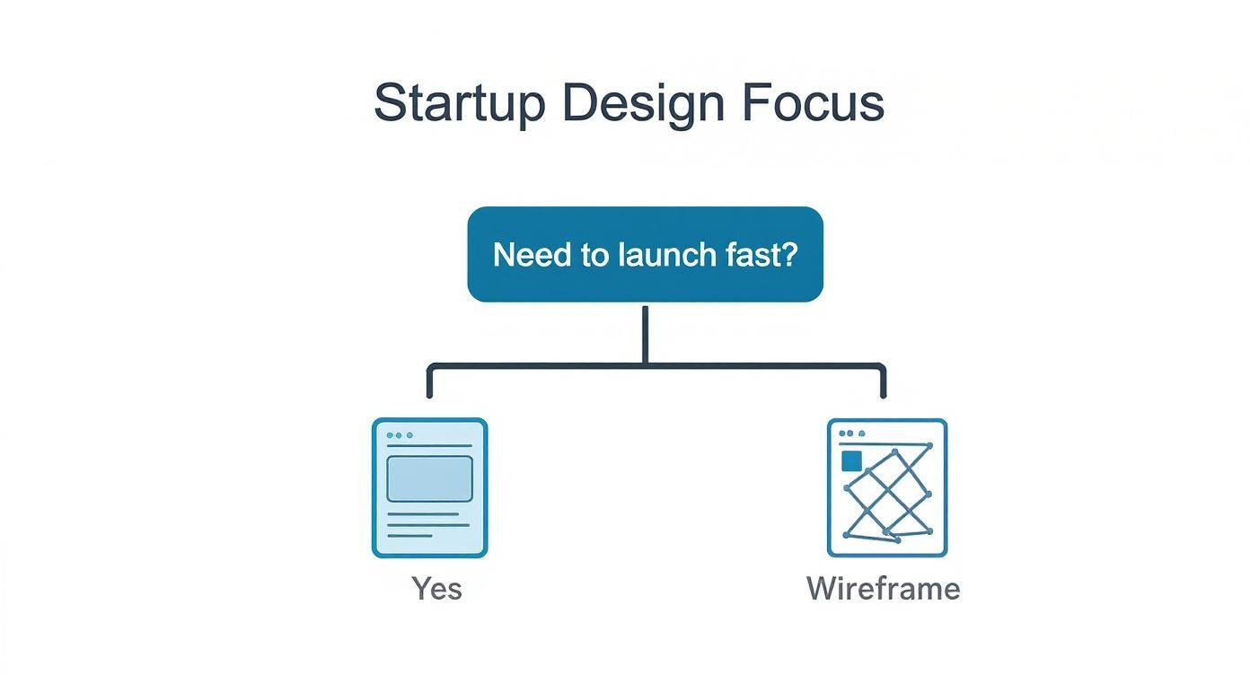
As the graphic makes clear, if your main goal is getting to market quickly, a template-based approach is often the logical starting point. On the other hand, complex, unique requirements almost always point towards a more bespoke build.
A Framework for Making the Right Choice
To make an informed decision, you need to be honest about your startup’s resources and goals. Forget what’s trendy and focus on these practical questions. Your answers will point you towards the most sensible path for your business.
- What is your budget? A custom-built site can run into the tens of thousands, while a builder might only be a few hundred pounds a month. Be realistic about your financial runway.
- What are your in-house skills? Got a developer on the founding team? If not, a no-code solution like Webflow will be far more empowering than a custom codebase you can’t manage.
- How fast do you need to launch? Website builders are the fastest way to get a professional site live. Custom development is a much longer process, often taking several months from start to finish.
- What are your long-term scalability needs? If you're building a simple marketing site, a builder is fine. If you’re creating a complex web application with unique user features, a custom solution will almost certainly be necessary down the line.
Interestingly, more UK startups are prioritising unique digital experiences from day one. Industry reports show 72% of UK web design agencies have seen a rising demand for custom development from startups, with many allocating a significant slice of their initial funding to their web presence. This shows a growing understanding that a unique site is a powerful differentiator. You can read more about these web design statistics and see how the market is shifting.
For many founders, the dilemma is whether to try a DIY approach or invest in professional help from the start. To help you weigh the pros and cons, our guide on a DIY website versus hiring a professional provides a detailed breakdown.
Ultimately, choosing the right tech is about finding the sweet spot between your current needs and your future vision, ensuring your website design for startups is built on a foundation that can grow with you.
From Development Hell To A Smooth Launch

With your designs signed off and the tech stack chosen, you’re in the final sprint. This is where static visuals become a living, breathing website. It’s an exciting phase but it can quickly get overwhelming without a clear process. Knowing the key stages helps you manage the journey and sidestep the common pitfalls that derail projects just metres from the finish line.
The build is generally split into two core disciplines: front-end and back-end development. Getting a basic grip on what these mean will empower you to have much more productive conversations with your development team.
Understanding The Build Process
Front-end development is everything your visitors see and interact with. It's the craft of turning your approved design mockups into functional code that works perfectly in a web browser. Think of it as building the interior of a house—the paint on the walls, the furniture placement and the light switches that actually work.
The back-end is the engine room. It’s the server, the database and all the application logic that powers what people see on the front-end. If your website has a user login, a contact form that sends emails or any dynamic content, that’s all handled by the back-end. It’s the plumbing and wiring hidden behind the walls.
The magic of a great website happens when the front-end and back-end work together seamlessly. A beautiful design is useless if the underlying technology is slow or broken, and powerful back-end features are wasted if the user interface is impossible to navigate.
Of course, the cost of this phase is a major consideration. The expense of website design for startups in the UK varies widely. A DIY site builder might cost £50-£100 a month but a custom build from an agency often lands somewhere between £2,000 and £9,000 . And given that 84% of UK visitors now prefer mobile sites, a mobile-first approach isn’t just a trend; it's a basic requirement. You can discover more about the costs and statistics of small business websites to help with your budgeting.
The Crucial Phase Of Rigorous Testing
Never, ever launch a website without putting it through its paces first. A few embarrassing bugs on day one can seriously damage your startup’s credibility before you’ve even had a chance to build it. A thorough testing phase is your best insurance policy against a disastrous first impression.
Your testing shouldn't just be a quick five-minute look-over. It needs to be a systematic process that covers every corner of the site.
Here’s what your testing checklist must cover:
- Functionality Testing: Does every single button, link and form work as expected? Can users sign up, log in and complete key actions without hitting a dead end? This is about ensuring the core mechanics are solid.
- Cross-Browser Compatibility: Your site might look perfect in Chrome but appear broken in Safari or Firefox. Test it across all major browsers to ensure a consistent experience for every visitor.
- Mobile Responsiveness: This is completely non-negotiable. Pull up your website on different smartphones and tablets. Do the layouts adjust correctly? Are the buttons big enough to tap? Is the text readable without pinching and zooming?
- Performance Checks: How fast does your site load? Slow loading times are a huge source of frustration and will tank your search engine rankings. Use tools to check your page speed and find any bottlenecks.
Your Pre-Launch Final Checks
You’re almost there. The site has been built, tested and polished. Before you hit the big red button, run through one final, comprehensive checklist. This ensures you have all the foundational bits in place for a successful launch and a smooth transition into marketing and analytics.
Your pre-flight checklist should include these essentials:
- Basic On-Page SEO: Make sure every page has a unique and descriptive title tag and meta description. These are crucial for helping search engines understand your content and for convincing users to click through from search results.
- Google Analytics Setup: You need to be tracking visitor behaviour from day one. Make sure your Google Analytics tracking code is correctly installed on every single page. Set up basic goals, like form submissions, to measure what matters.
- Favicon and Social Sharing Images: Upload a favicon (the tiny icon in the browser tab) to reinforce your brand. Also, make sure you have designated images that appear when your pages are shared on social media.
- Final Content Proofread: One last read-through of all your website copy is vital. Typos and grammatical errors look unprofessional and can undermine the very trust you’re trying to build.
Once these boxes are ticked, you’re ready for a smooth and confident launch.
Your Top Startup Web Design Questions, Answered
Jumping into your first website build can feel like opening Pandora's box. Suddenly, there are more questions than answers. To help you cut through the noise and make better, faster decisions, we’ve put together some straight answers to the questions we hear most from UK founders.
How Much Should a UK Startup Budget for a Website?
This is always the first question and for good reason. In the UK, the cost of a new website generally falls into one of three brackets.
If you go the DIY route with a platform like Squarespace, you're looking at around £50-£100 per month . It's a solid starting point if you're comfortable with templates and have the time to learn the ropes.
For something more bespoke, bringing in a freelance web designer will likely cost between £1,500 and £5,000 . If you need more strategic input and project management, a small agency is the next step up, with projects typically starting from £5,000 and going up to £9,000+ .
The key is to see this as an investment in your primary growth engine, not just another business expense.
How Long Does It Take to Build a Startup Website?
Timelines can vary wildly depending on the complexity of the site and, honestly, how prepared you are. A simple, template-based website can be up and running in as little as 2-4 weeks but that's assuming you have all your content, branding and imagery ready to go.
For a more customised build with specific features or integrations, a realistic timeframe is somewhere between 8 and 12 weeks .
Funnily enough, delays in a website project are almost never due to the build itself. They’re usually caused by slow client feedback, content not being ready or the scope of the project changing halfway through.
Want to keep things on track? Have your final copy, images and brand guidelines signed off before a single line of code is written.
What Are the Must-Have Features for an MVP Website?
The whole point of a Minimum Viable Product (MVP) website is to launch lean, learn from real users and avoid getting bogged down by unnecessary features. To pull that off, your site needs to nail the essentials.
Your MVP website absolutely has to have:
- A crystal-clear value proposition. Anyone landing on your homepage should understand what you do in five seconds or less.
- A simple, working sign-up or contact form. You need to start capturing leads from day one.
- A fully responsive design. It must work flawlessly on mobile, because that’s where a huge chunk of your audience will find you.
- Basic on-page SEO foundations. This means unique title tags and meta descriptions for every page. It’s the small stuff that makes a big difference.
Anything else is probably a 'nice-to-have' for a later version. Get the fundamentals right, launch fast and let user data tell you what to build next.
Should We Use a Website Template or a Custom Design?
This is a big strategic decision that really depends on where you are right now and where you plan to go.
Templates are brilliant for speed and keeping costs down. They're a fantastic choice for validating a business idea or getting to market when you're working with a tight budget.
The trade-off is that their limitations can start to pinch as you grow. Your branding might feel a bit generic and you'll eventually hit a wall when you need functionality that the template just doesn't support.
A custom design gives you a completely unique brand experience and is built to scale with your ambitions. But it requires a much bigger upfront investment in both time and money.
Think about your immediate priorities. If speed and budget are everything, a template is a smart move. If brand differentiation and long-term flexibility are non-negotiable, then a custom build is the better path forward.
Ready to build a website that drives growth for your startup? The team at Superhub specialises in creating strategic, high-performance websites that deliver results. Find out how we can help.
Want This Done For You?
SuperHub helps UK brands with video, content, SEO and marketing that actually drives revenue. No vanity metrics. No bullsh*t.