

How to Improve Website Conversion Rate: A Practical Guide for UK Businesses
Improving your website’s conversion rate isn’t about chasing more traffic. It’s about turning the visitors you already have into customers, leads or enquiries. It means making your existing traffic work harder by focusing on outcomes , not just clicks.
The real job is to find and fix all the little points of friction that stop people from taking that final step.
Stop Wasting Clicks and Start Converting Customers
Let’s be honest. Most UK businesses are obsessed with getting more traffic. They pour money into SEO and ads, but if their website can’t convince visitors to actually do something—buy a product, book a call, fill out a form—they’re just paying for clicks that go nowhere.
That’s like spending a fortune on glossy brochures only to leave them in a locked room. Conversion Rate Optimisation (CRO) is how you fix that leaky bucket.
It’s about making small, intelligent changes based on real user data to increase the percentage of visitors who take action. This isn’t about guesswork or changing a button colour because you fancy a change. It’s a methodical way to make your website more effective and, ultimately, more profitable. For example, understanding how accessibility boosts your website's UX and sales shows how seemingly minor adjustments can have a massive impact on your bottom line.
What Does a Good Conversion Rate Look Like in the UK?
There’s no single magic number. A "good" rate for a local Devon tradesperson generating quote requests will be completely different from a national motorsport team selling hospitality packages. What really matters is understanding your sector's benchmark so you can see where you stand.
Even a small lift can translate into huge revenue gains. In 2025, UK-focused agency Blubolt reported that the average UK ecommerce conversion rate is 3.4% . That means for every 1,000 visitors, only about 34 are converting.
If your business is sitting at 2%, you’re underperforming by around 41% . Moving from 2% to 3.4% would add 14 extra conversions for every 1,000 visits. That's a 70% uplift in results from the exact same traffic.
Too many businesses focus on the vanity metric of website traffic instead of the sanity metric of profit. CRO shifts the focus from getting more visitors to getting more value from the visitors you already have.
If you have a feeling your site isn't pulling its weight, our guide on why your website isn't converting and how to fix it is the perfect place to start.
The table below gives you a quick snapshot of what to aim for across different UK industries.
UK Conversion Rate Benchmarks: What to Aim For
This table provides a quick reference for average conversion rates across key UK sectors. Use it to gauge how your performance stacks up against the competition and identify where you have opportunities to improve.
| UK Industry Sector | Average Conversion Rate | What This Means For You |
|---|---|---|
| Ecommerce (General Retail) | 3.4% | If you're below this, look at checkout friction, product pages and delivery costs. |
| Lead Generation (B2B Services) | 2.5% - 5% | Highly variable. Focus on the clarity of your offer and the ease of making an enquiry. |
| SaaS (Software as a Service) | 1.5% - 3% | Free trials are key. Is your sign-up process simple and your value proposition clear? |
| Travel & Hospitality | 2.1% | Booking engines are often the weak link. Simplicity and trust signals are vital. |
| Automotive (Dealerships) | 1.8% - 2.8% | Conversions here are often test drive requests or finance applications. Make them easy to find. |
Remember, these are just averages. The real goal isn't just to meet the benchmark, but to continuously test and improve upon your own numbers, turning more of your hard-earned traffic into tangible business results.
Building Your CRO Framework to Find What’s Broken
Before you touch a single button or rewrite a headline, you need a plan. Jumping into random changes is the fastest way to waste time and achieve nothing. Proper Conversion Rate Optimisation (CRO) starts with a solid framework for diagnosing what’s actually broken on your site, not just what you think is broken.
Guesswork has no place here. The goal is to build a repeatable process for finding the friction points, understanding why users bail, and setting clear, measurable goals. This isn't about getting lost in complicated spreadsheets; it's about using free, powerful tools to get straight answers from your data.
Conducting a No-Nonsense Website Audit
First things first, you need to get comfortable with your analytics. You have to understand how people are currently using your site – where they come from, what they look at, and most importantly, where they give up and leave. But before you can trust the story your data is telling you, you need to be sure the data itself is clean. This guide on 7 signs your analytics is broken and how to fix it is a must-read to ensure you're working with accurate information.
For this job, two tools are indispensable: Google Analytics and Microsoft Clarity. Both are free, and they give you two different but equally valuable sides of the story.
- Google Analytics (GA4): This is your source for the hard numbers – the 'what'. It tells you which pages have the highest exit rates, which traffic sources bring in the most engaged visitors, and how users move (or don't move) through your site.
- Microsoft Clarity: This gives you the context – the 'why'. With session recordings and heatmaps, you can literally watch real user sessions. See where they click, where they get stuck, and where they get frustrated. It’s like looking over a user’s shoulder without being creepy.
This simple diagram shows the ideal journey from a website visitor to a paying customer.
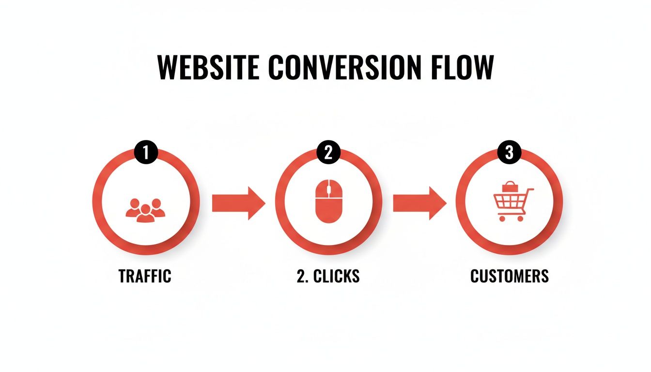
Your audit's job is to find the exact point in this flow where the biggest drop-offs are happening.
Finding the Friction Points
Your entire audit should focus on one thing: uncovering the roadblocks that kill conversions. Start by looking for obvious patterns. Are mobile users abandoning the checkout page in droves? Is your main service page getting tons of traffic but generating zero enquiries?
This is where you combine the 'what' from Analytics with the 'why' from Clarity.
If Google Analytics shows a shockingly high exit rate on your contact page, that’s a red flag. But watching a few session recordings in Clarity might reveal the culprit: a confusing form, a button that doesn’t work on certain browsers or a CAPTCHA that’s impossible to solve.
Keep an eye out for these classic problem areas:
- High-Traffic, Low-Conversion Pages: These are your biggest opportunities. They attract visitors but fail to convince them to take the next step.
- Major Drop-Off Points in Your Funnel: Pinpoint the specific step where most people leave. Is it the basket, the shipping details or the final payment page? To really get a handle on this, you need a clear picture of the ideal user's path. Mapping it out is a great way to see where things are breaking down; we explain what a customer journey map is and how to master it in our detailed guide.
- Technical Glitches: Clarity is brilliant for spotting 'rage clicks' – users hammering a button or link that doesn't work. It also flags JavaScript errors that could be quietly sabotaging the user experience.
Setting KPIs That Actually Mean Something
Once you’ve found the problems, you need to set clear goals. Vague targets like "get more leads" are useless. You need specific Key Performance Indicators (KPIs) that connect directly to a business outcome. A good KPI is specific, measurable and tied to a single, meaningful action.
Here’s how to turn those fuzzy goals into sharp, actionable KPIs:
| Vague Goal | Actionable KPI |
|---|---|
| "Increase leads" | Increase contact form submissions by 20% in Q3. |
| "Sell more products" | Reduce basket abandonment rate from 65% to 55%. |
| "Get more phone calls" | Increase 'click-to-call' button taps on mobile by 30%. |
These KPIs give you a clear target. They transform your CRO work from a series of random tweaks into a focused campaign. You'll know exactly what you’re trying to achieve and, crucially, you'll be able to measure whether your changes actually worked. This data-led diagnosis is the foundation of any successful CRO strategy.
How to Prioritise Fixes That Make a Real Difference
So, you’ve dug into the data and now you have a list of a dozen things that might be broken. The temptation is to dive straight in and start changing everything at once. Don't. A scattergun approach just creates chaos, making it impossible to figure out which changes actually worked.
Smart CRO is all about making strategic, prioritised fixes. It’s about getting the biggest impact for the least effort. This is where you move from diagnosis to action, but you do it with a plan. You need a simple way to sort the high-impact opportunities from the time-wasting tweaks.

The PIE Framework: Your Prioritisation Tool
To avoid getting overwhelmed, a simple model like the PIE framework is your best friend. It forces you to score each potential fix against three key criteria, giving you a clear, logical order of attack. It’s all about focusing your resources where they’ll actually move the needle.
Here’s the breakdown:
- Potential: How much improvement can you realistically expect from this change? Fixing a checkout page that loses 80% of your users has far more potential than tweaking a blog post headline.
- Importance: How valuable is the traffic to the page in question? A fix on a high-traffic, high-value service page is obviously more important than one on a rarely visited 'About Us' page.
- Ease: How quickly and easily can you get this done? Changing a line of text is easy. A complete redesign of your booking system is not.
Score each idea from 1 to 10 for each of these three areas, add them up and tackle the highest-scoring items first. This no-nonsense method cuts straight through the noise and points you to the quick wins.
Forming a Strong Hypothesis for Every Test
Once you’ve chosen what to fix, you need to be precise about why you’re fixing it. Every single change should be based on a clear, testable hypothesis. This isn't some academic exercise; it's a simple statement that clarifies what you’re changing, what you expect to happen and your reasoning.
A solid hypothesis follows a simple structure: "By changing [X] to [Y], we believe it will cause [Z outcome] because [reason]."
For example: "By changing the call-to-action button text from 'Submit' to 'Get My Free Quote', we believe it will increase form completions by 15% because the new copy clarifies the immediate value for the user."
This approach turns a vague idea into a measurable experiment. You have a clear prediction and a rationale behind it, which is fundamental to understanding what truly drives behaviour on your site.
Running A/B Tests That Give Clear Answers
A hypothesis is just a theory until you test it. The best way to do that is with A/B testing (or split testing). This involves showing two versions of a page to different segments of your audience at the same time to see which one performs better against your KPI.
Version A is your existing page (the 'control'), and Version B is the page with your proposed change (the 'variation').
Setting up an A/B test doesn't have to be massively technical. Tools like VWO or Optimizely make it relatively straightforward, and many modern CMS platforms have features built in.
The golden rules for a reliable test are:
- Test One Thing at a Time: If you change the headline, the button colour and the main image all at once, you’ll have no idea which element actually caused the shift in conversions. Isolate your changes.
- Run It Long Enough: Don't declare a winner after a single day. You need enough data to reach 'statistical significance' – typically 95% confidence . This means the result is highly unlikely to be a random fluke.
- Don't End It Too Early: Let the test run for at least one full business cycle (like a full week) to smooth out any daily fluctuations in user behaviour.
Interpreting the results is where it all comes together. If your "Get My Free Quote" button gets 20% more conversions with 97% statistical confidence, you have a clear winner. You’ve just made a data-backed decision that will improve your conversion rate. Each successful test builds momentum and, more importantly, revenue.
Of course, knowing the financial impact is just as crucial as the conversion lift. For a deeper dive, check out our guide on how to measure marketing ROI for UK businesses.
Practical Website Fixes That Consistently Win

Right, you’ve spotted the leaks in your funnel and have a prioritised list of what to tackle first. Now it’s time to get your hands dirty with the practical, on-the-ground changes that consistently move the needle.
This isn't about some grand reinvention. It's about implementing proven tactics that smooth out the user journey and remove the tiny points of friction that kill conversions. We're talking about tangible improvements to user experience (UX), copy, design and technical performance – the nuts and bolts of a website that actually works.
Simplify the User Experience
The golden rule of UX is painfully simple: don't make your users think .
Every second they spend trying to figure out your website is a second they could be clicking away to a competitor. Your job is to make their path from A to B as smooth and obvious as possible.
Start with your navigation. Is it clean, logical and instantly understandable? Can a first-time visitor find what they need within five seconds of landing on your homepage? If not, strip it back. Ditch the confusing jargon and cluttered drop-down menus.
Next, attack your forms. Nobody enjoys filling out forms, so your mission is to make them as painless as you can. Every single field you ask for adds friction and inches the user closer to abandoning the whole thing. Do you really need their fax number in 2024? Get rid of it. Only ask for the absolute essentials.
Write Copy That Sells an Outcome
Your website copy shouldn’t just describe what you do; it should sell the result your customer gets. People don't buy drills; they buy holes. Your headlines and calls-to-action (CTAs) are the most critical bits of text on your entire site.
Focus on benefit-led headlines. Instead of "Our SEO Services," try "Get More Customers From Google." The first is a feature; the second is a benefit. It speaks directly to a business owner's actual goal.
Your CTA buttons need the same treatment. Vague words like 'Submit' or 'Click Here' are conversion killers. Be specific and value-driven. "Get My Free Quote," "Book My Test Drive" or "Download the Guide" tells the user exactly what they're getting in return for their click.
Concrete UK case studies show how small on-page changes can dramatically improve conversion rates without spending a penny more on traffic. Enhance Insurance, a UK provider, saw a 138% increase in landing page conversions just by adding more CTAs above the fold and tweaking the button copy to match how their audience speaks. For a Devon tourism site selling £250 packages, an uplift like that means going from 20 to 48 bookings per 1,000 visitors. You can find more insights like this in these CRO statistics and case studies on LeadForensics.com.
Nail Your Design and Visuals
First impressions are formed in milliseconds, and your website’s design does the heavy lifting in building trust. A dated, cluttered or amateurish design quietly screams "don't trust us with your credit card details."
Use high-quality, professional images and videos that feel authentic. Generic stock photos are a complete waste of space. If you're a tradesperson in Devon, show crisp photos of your actual work in the local area. If you’re in motorsport, use dynamic, high-energy imagery from the track.
Your design should also guide the user's eye towards the most important element on the page: the call-to-action. Use visual cues like contrast, colour and plenty of white space to make your CTA buttons pop. They shouldn't just blend in; they should be impossible to miss.
Master Technical and Mobile Performance
All the brilliant copy and slick design in the world won't matter if your site is slow and clunky, especially on a phone. Page speed isn't just a technical SEO metric; it's a massive conversion factor. Study after study shows that every extra second of load time sends conversion rates plummeting.
Test your site speed with Google's PageSpeed Insights and start working through the issues it flags. This usually involves compressing images, simplifying code and using a decent UK-based web host.
And mobile optimisation? It's simply non-negotiable. With more than half of all web traffic now coming from mobile devices, your site has to deliver a seamless experience on a small screen. That means large, tappable buttons, text that’s easy to read without pinching to zoom, and simple, thumb-friendly navigation. If someone has to fight with your website on their phone, they won't convert. They'll just leave.
To pull these ideas together, here’s a quick-reference table of common problems and the high-impact fixes you can start testing right away.
High-Impact CRO Changes to Test Now
| Website Element | Common Conversion Killer | Actionable Fix to Test |
|---|---|---|
| Navigation Menu | Too many options, confusing labels. | Simplify to 4-5 core items. Use clear, user-focused language (e.g., "Services" not "Solutions"). |
| Contact/Lead Form | Too many fields, no clear value. | Remove all non-essential fields. Test changing a vague 'Submit' button to a benefit-led CTA. |
| Page Headlines | Describes the feature, not the benefit. | A/B test a headline that focuses on the desired outcome for the customer. |
| Page Speed | Slow load times ( over 3 seconds ). | Compress all images. Check your hosting plan. Remove unnecessary scripts. |
| Mobile View | Desktop site shrunk down, hard to use. | Ensure buttons are large and easy to tap. Check that forms are simple to complete on a phone. |
These are the fundamentals that underpin almost every successful website. Getting them right provides a solid foundation for all the more advanced CRO tactics that follow.
Getting Specific: Tailoring Your CRO for UK Niche Markets
Generic conversion advice is a complete waste of time. The tactics that work for a national ecommerce brand selling trainers are utterly useless for a specialist motorsport team trying to attract sponsors. Knowing how to improve website conversion rate means understanding that what you're converting is just as important as how you do it.
Your industry, your audience and your specific business goals dictate your entire approach. A universal "good" conversion rate simply doesn't exist; chasing one is a fool's errand. Industry differences inside the UK are critical – a BTCC team seeking sponsorship doesn't convert like a Devon florist or a local garage selling MOT bookings.
UK data compiled by Blubolt shows grocery sites converting at a massive 11.1% , while tools and construction supplies sit at 8.4% . Contrast that with a 2025 study from Ruler Analytics , which found the average website conversion rate across B2B and professional industries was just 2.9% . For our core niches – motorsport, automotive and local services – this proves that chasing a flat “5% is good” rule is totally misleading.
This is where we get specific. Let's break down a real-world CRO strategy for the markets we know inside and out.
For Motorsport Teams Attracting Sponsors
A race team’s website isn't an online shop; it’s a high-stakes B2B lead generation tool. The primary conversion isn't a small sale, it's the beginning of a high-value conversation.
The goal here is to move a potential sponsor from casual interest to a properly qualified lead.
-
The Real Conversion Action: A brochure download is a decent micro-conversion, but the real prize is a meeting request or a direct enquiry from a decision-maker.
-
Smarter CRO Tactics: Don’t just slap a "Download Brochure" button on the page. Test a two-step process. The first step captures their email for the download. But the immediate follow-up page should offer to "Book a Call with Our Commercial Director" using a simple calendar integration. This instantly filters out the tyre-kickers from the serious prospects.
-
Laser-Focused Content: Your site has to scream commercial value. You need to showcase previous sponsor ROI, broadcast viewing figures and detailed hospitality benefits. Use high-quality video of your trackside presence to sell the experience and prove you're the real deal.
For Automotive Dealerships Booking Test Drives
A car dealership's website has one primary job: get people from behind their screens to behind the wheel of a car. Every single element on a Vehicle Detail Page (VDP) must lead to that one outcome.
Don't make visitors hunt for the next step. If the main goal is a test drive, that call-to-action needs to be the most dominant, unmissable element on the page, visible on both desktop and mobile without scrolling.
Your CRO efforts here need to be surgical.
-
Clear, Uncluttered VDPs: Get rid of anything that distracts from the core actions: "Book a Test Drive," "Get a Finance Quote" and "Value My Part-Exchange." Less is more.
-
Sticky CTAs on Mobile: As a user scrolls through photos on their phone, a sticky banner at the bottom of the screen with a "Book Test Drive" button keeps the main conversion action in constant view. It’s a simple change that makes a huge difference.
-
Essential Trust Signals: High-resolution images and walk-around videos are completely non-negotiable. Add clear pricing, finance examples and genuine customer reviews directly on the VDP to answer questions before they become deal-breaking objections.
For Devon Tradespeople Securing Quote Requests
For a local plumber, electrician or builder in Devon, trust is everything. Your website has to instantly convince a homeowner that you are reliable, local and professional. The conversion goal is brutally simple: get them to pick up the phone or fill in your quote form.
The entire focus should be on building immediate local credibility.
-
Hyper-Local Proof: Don't just say you work in Devon. List the specific towns you cover (Paignton, Torquay, Exeter). Feature testimonials from local customers, complete with their town, to create a powerful sense of community and relevance.
-
Simplified Contact: Your phone number should be huge and prominently displayed at the top of every single page. Your quote request form should ask for the absolute bare minimum: name, phone number, postcode and a brief description of the job. Don't ask for their life story.
-
Show, Don't Tell: A gallery of recent, high-quality photos of your work in local properties is more powerful than any sales copy you could ever write. It proves you can deliver the goods.
By tailoring your tactics to your specific market, you move from guessing to executing a precise, informed strategy. This is how you stop wasting clicks and start generating the outcomes that actually grow your business.
Your CRO Questions Answered
We’ve covered the framework, the fixes and the industry-specific tactics. But let’s be honest, you probably still have a few questions rattling around.
Here are the straight-up, no-nonsense answers to the most common queries we get from UK business owners about improving their website conversion rate.
How Much Traffic Do I Need to Start CRO?
This is a common sticking point, but there’s no magic number. The real question is whether you have enough data to run a meaningful A/B test. For a test to reach statistical significance (usually 95% confidence), you need a decent volume of conversions to compare.
As a rough guide, aim for at least 1,000 unique visitors and 50 conversions per variation (your original page and the new one) within a month. If your traffic is lower than this, formal A/B testing can be slow, painful and unreliable.
But that doesn’t mean you can’t do CRO. If you’re in the low-traffic club, just switch your focus to qualitative data. Use tools like Microsoft Clarity to watch session recordings and gather user feedback. These insights are pure gold and can easily justify making changes based on clear user frustration, even without a formal A/B test.
How Long Does It Take to See Results?
Anyone who gives you a fixed timeline is selling you snake oil. The time it takes to see results depends entirely on your starting point, your traffic and the changes you’re making.
A simple, high-impact change like fixing a broken checkout button on a high-traffic ecommerce site could show a positive result within days. In contrast, testing a completely new value proposition on a B2B service page might take a month or more to gather enough data for a clear verdict.
CRO is a marathon, not a sprint. It's a continuous process of learning and improvement, not a one-and-done project. The real goal is to build momentum with small, consistent wins that compound over time.
What Tools Are Essential for a Small Business?
You don't need a massive, expensive tech stack to get started. A few free or low-cost tools will give you 80% of the insights you need to make a real difference.
Here’s your essential starter kit:
- Google Analytics (GA4): This is non-negotiable and completely free. It tells you what is happening on your site – which pages people visit, where they come from and where they bail.
- Microsoft Clarity: Also free, this tool tells you why things are happening. With session recordings and heatmaps, you can see exactly where users are struggling, getting confused or getting frustrated.
- A/B Testing Tool: For running tests, you have options. Google Optimize used to be the free go-to, but it's been sunsetted. Many website platforms like Shopify or Squarespace have basic A/B testing built in. For more power, tools like VWO offer free trials and affordable starter plans.
Start with these three. Master them, get some wins under your belt and only then consider adding more complex tools to your arsenal.
Ready to stop guessing and start converting the traffic you already have? At SuperHub , we're a digital marketing agency based in Devon that builds marketing and web solutions that deliver real, measurable results for UK businesses. No fluff, no waffle—just a focused strategy to turn more of your visitors into customers.
Want This Done For You?
SuperHub helps UK brands with video, content, SEO and marketing that actually drives revenue. No vanity metrics. No bullsh*t.