
How to Create Brand Guidelines That Actually Work
Brand guidelines are much more than a rulebook for your logo. They are the blueprint for consistency, codifying everything from your core mission and values right through to the visual and verbal identity that brings your brand to life. It’s the strategic document that ensures everyone—from your marketing team to external partners—presents your brand with a single, unified voice.
Laying the Foundation for Your Brand Guidelines
Before you even think about picking a colour palette or designing a logo, you have to dig deeper. It's a classic mistake: businesses get excited and jump straight into the aesthetics, ending up with guidelines that look slick but feel hollow. To avoid that trap, you need to articulate the very core of your brand's existence first.
This isn’t just a philosophical exercise; it's a strategic imperative. The answers you come up with here will dictate every single decision that follows. It's all about asking the big questions: Why does this company exist beyond making a profit? What future are we trying to build? What principles will we never, ever compromise on?
Nailing this gives your brand a soul.
Define Your Brand's Purpose, Mission, and Vision
Your brand’s foundation is built on three pillars: purpose, mission, and vision. People often use these terms interchangeably, but they each have a distinct and vital role.
- Purpose (The Why): This is your reason for being. It’s the fundamental impact you want to have on your customers, your industry, or the world. A sustainable fashion brand’s purpose, for example, might be "to make ethical style accessible to everyone."
- Mission (The How): This is your game plan for bringing that purpose to life. It’s what your company actually does day in, day out. For that same fashion brand, the mission could be "to create high-quality, eco-friendly clothing using transparent supply chains."
- Vision (The What): This is the future you're aiming for. It’s an aspirational snapshot of where you want your brand and its community to be down the line. Their vision might be "a world where fashion and sustainability are inseparable."
This strategic direction gives you the narrative—the story that pulls in customers and attracts employees who believe in what you’re doing. You can learn more about how this works in our guide on how brand storytelling builds loyalty and revenue.
Before diving into the visual aspects, it's essential to define these strategic components clearly. This table breaks down what each element covers and the key question it helps you answer.
Core Brand Strategy Components
| Component | What It Defines | Example Question to Answer |
|---|---|---|
| Purpose | Your brand's fundamental reason for existence beyond profit. | Why do we do what we do? What positive change do we want to create? |
| Mission | The actionable steps your company takes to achieve its purpose. | What do we do every day to work towards our purpose? |
| Vision | The long-term, aspirational future your brand is helping to create. | If we succeed, what does the world look like in 5-10 years? |
| Values | The core principles that guide your brand's behaviour and decisions. | What do we stand for? What beliefs will we never compromise on? |
Having these elements locked in provides the 'why' behind every design choice you'll make later on.
Understand Your Target Audience and Personas
Once your core strategy is set, you need to get crystal clear on who you're talking to. A brand that tries to be for everyone ends up meaning nothing to anyone. This is where defining your target audience and creating detailed customer personas becomes absolutely critical.
Personas are semi-fictional characters that represent your ideal customers, built from market research and real data. Go deeper than just basic demographics. You need to explore their psychographics: their goals, their biggest challenges, their values, and what truly motivates them. What keeps them up at night? What does a 'win' look like in their world?
By creating detailed personas, you stop broadcasting a generic message and start having a focused conversation. This deep understanding ensures every part of your brand—from its tone of voice to its imagery—is crafted to connect with the right people on an emotional level.
Establish Your Brand Personality and Voice
Your brand personality is essentially the set of human characteristics you want people to associate with your company. Are you the knowledgeable guide, the playful friend, or the sophisticated leader?
This personality is what shapes your brand's voice and tone. A "knowledgeable guide," for instance, would use an authoritative yet helpful tone. A "playful friend" would sound much more informal, maybe even a bit humorous.
Consistency here is everything if you want to build trust. In fact, research shows that a staggering 81% of UK consumers need to trust a brand before they will even consider buying from them. Having clear guidelines is the first step, but before that, it's crucial to grasp how to create a memorable brand identity that forms the core of your strategy. This ensures every interaction feels authentic and strengthens the emotional connection that turns casual buyers into loyal fans.
Defining Your Visual Identity Elements

Once your brand’s strategic foundation is locked in, it’s time to give it a face. This is the fun part, where your purpose, personality, and values get translated into a tangible visual system that people can actually see and connect with. A powerful visual identity makes your brand instantly recognisable, whether it’s on a tiny social media icon or a massive billboard.
This isn’t about just picking a few colours you like. It's a series of deliberate decisions that have to reflect your core strategy and resonate with the right people. Every single visual element needs to work together to tell a cohesive story, reinforcing what your brand is all about at every single touchpoint.
The goal here is to build a set of assets and rules that are flexible enough for creativity but strict enough to keep everything consistent. Get this right, and you’ll create a visual language that becomes completely synonymous with your brand.
Establishing Clear Logo Usage Rules
Your logo is the most concentrated version of your brand, so protecting its integrity is non-negotiable. Your brand guidelines must lay down clear, unambiguous rules for how it should be used—and just as importantly, how it shouldn't. Think of it as creating a personal space bubble for your logo.
First, you need to define its clear space . This is the minimum amount of empty space that has to surround the logo, making sure it stands out and doesn't get cluttered by other text or graphics. A really common way to do this is to use a key element from the logo itself, like the height of a specific letter, to define this exclusion zone.
Next up is minimum size . You need to specify the absolute smallest your logo can appear in both digital and print. A logo that's too small becomes a blurry mess and loses all its impact. Define these sizes in pixels for screens and millimetres for print to take all the guesswork out of it.
Finally, show people what not to do. This is one of the most critical parts of the job. Providing clear visual examples of incorrect usage is the best way to prevent common—and often painful—mistakes.
- Don’t ever stretch or distort the logo’s proportions.
- Don’t change the logo’s colours to anything outside the approved palette.
- Don’t place the logo on a busy or low-contrast background that makes it hard to see.
- Don’t add drop shadows, glows, or other unauthorised effects.
These rules are your first line of defence against the slow dilution of your brand’s most important identifier.
Developing a Strategic Colour Palette
Colour is a seriously powerful communication tool. It can evoke emotion and send a message in an instant. Your brand's colour palette should be a strategic selection that reflects your personality and connects with your audience. A well-defined palette is the secret to visual harmony across everything you produce.
Your guidelines need to break the palette down into distinct tiers, each with its own job.
- Primary Colours: These are your core colours, usually one to three, that will become most associated with your brand. They should be the ones you see most often.
- Secondary Colours: This is a complementary set of colours used to highlight key information, add a bit of visual interest, or differentiate product lines. They’re there to support the primary palette, not overpower it.
- Neutral Colours: These are typically your shades of grey, white, or off-white. You'll use these for body text and backgrounds to create balance and make sure everything is readable.
For every single colour in your palette, you must provide its specific values for different uses. This is non-negotiable for consistency. Include HEX codes for web, RGB values for digital screens, and CMYK values for printed materials.
This level of detail ensures that your brand’s signature blue looks exactly the same on a business card as it does on your website. For businesses starting from scratch, exploring a professional brand design package can be a huge help in making sure all these visual elements work together from day one.
Selecting Your Typography System
Typography gives your brand its written voice. The fonts you pick say a lot about your personality—a classic serif font can feel traditional and authoritative, while a clean sans-serif font often comes across as modern and approachable. Your typography system must be clear, legible, and, above all, consistent.
A solid system usually involves a primary and a secondary typeface. The primary typeface is often the one you use for headings and big marketing messages—it’s the one with the most character. The secondary typeface , on the other hand, is your workhorse, typically used for body copy and long blocks of text where readability is the top priority.
Your guidelines must establish a clear typographic hierarchy. This means defining the specific font, weight, and size for different levels of text.
- Heading 1 (H1): The main title on a page or document.
- Heading 2 (H2): Major section titles.
- Heading 3 (H3): Subheadings within those sections.
- Body Text: Your main paragraph text.
- Captions & Labels: Smaller text for supporting information.
By setting these rules, you make sure that every piece of communication, from a landing page to an annual report, has a professional and consistent structure that’s easy for the reader to follow. This kind of attention to detail transforms text from just words on a page into a key part of your brand experience.
Crafting Your Brand Voice and Messaging
While your logo and colours give your brand a face, your voice gives it a personality. It’s the difference between a brand that feels like a faceless corporation and one that feels like a trusted friend.
How you speak is just as vital as how you look. It shapes customer perception, builds trust, and ultimately, dictates whether people want to do business with you. Getting this right in your brand guidelines is non-negotiable; it stops your messaging from feeling disjointed or, worse, completely off-brand.
This is where you stop talking about personality in abstract terms—witty, authoritative, empathetic—and start building a tangible set of rules for how you communicate. It’s not just what you say, but how you say it, every single time.
From Personality to Practical Rules
Turning a feeling like ‘friendly’ into a concrete writing style takes real thought. You need to break it down into simple dos and don’ts that anyone, from a new hire in marketing to a veteran in sales, can actually follow.
Let’s say your brand personality is ‘Empathetic and Supportive’ . Your rules for writing might look something like this:
- Use collaborative language: We talk in terms of "we," "together," and "let's," not a cold, distant "the company."
- Write with a reassuring tone: We use warmth and understanding, especially when talking about customer challenges.
- Kill the jargon: We explain things in simple, accessible language that makes people feel included, not confused.
On the other hand, a brand that’s ‘Bold and Authoritative’ would have a totally different playbook. Their style would lean on direct, confident statements, short sentences, and zero passive language. The trick is to forge an undeniable link between your brand’s character and the words you use to express it.
Building Your Messaging Pillars
Beyond the general tone, your guidelines need to lock in your core messaging pillars . These are the one to three big ideas you want to own in the minds of your customers. They’re the foundation of your brand story, reinforced again and again in your content, campaigns, and conversations.
Think of them as the main chapters of your story. For a tech company selling a productivity tool, the pillars might be:
- Effortless Efficiency: We save you time. Period.
- Seamless Integration: We work with the tools you already use.
- Data-Driven Insights: We give you the clarity to make better decisions.
Defining these pillars ensures that no matter who is writing or speaking on behalf of the brand, they’re hitting the same core notes. It keeps everyone on-script without making them sound like robots.
Your brand voice is the consistent personality behind your communications. Your tone is the emotional inflection that adapts to the situation. A consistent voice builds familiarity and trust; an adaptable tone makes you feel human.
For instance, your voice is always helpful. But your tone in an apology email will be serious and empathetic, a world away from the upbeat, excited tone you’d use for a new product launch. It’s a subtle but crucial difference. Too many businesses overlook this, but your tone of voice isn't fluff it's a revenue tool that has a very real impact on your bottom line.
Creating a Glossary of Terms
To lock in consistency, your brand guidelines should include a simple glossary. This is a practical, no-nonsense list of words to use and words to avoid. No more ambiguity.
Words to Use: This is your list of on-brand terminology, product names, and specific phrases. It makes sure everyone spells and capitalises key terms the same way.
- For example: We always refer to our customers as "members," never "users."
Words to Avoid: This list steers your team away from off-brand language, tired corporate jargon, or words that just don’t fit your values.
- For example: We avoid empty words like "synergy" or "leverage." We say "teamwork" and "use" instead.
This simple tool is incredibly powerful. It aligns everyone from your social media manager to your customer service reps, guaranteeing your brand sounds like one cohesive entity, every single time.
Making Your Imagery and Brand Application Crystal Clear
Your logo might be the star player, but the visuals surrounding it—photography, illustration, and iconography—are what truly set the mood. They're the non-verbal language that tells a deeper story about your brand. When your imagery is consistent, it doesn't just look sharp; it creates an emotional shorthand that helps people recognise you instantly.
This is where we move from theory to practice. It’s about setting down clear, actionable rules for all your brand’s visuals. The goal is to make sure every photo, icon, and illustration works together to strengthen your core identity, not dilute it.
Let's look at how to pull these visual and verbal elements together in the real world, using tangible examples that leave no room for guesswork.
Defining Your Photographic Style
Photography is often the first visual handshake you have with a potential customer. It needs to feel intentional, cohesive, and instantly recognisable as yours. To get there, your brand guidelines need to nail down a specific photographic style.
Break it down into simple, teachable ingredients:
- Subject Matter: What are you actually showing? Is it people connecting with each other, stunning close-ups of your product, or aspirational lifestyle scenes? Get specific about the focus.
- Composition: Do your shots feel clean and centred, or are they more dynamic and off-balance? Decide on your approach to framing.
- Lighting: Is the light bright and natural, or is it more dramatic with deep shadows and high contrast? Light completely changes the mood of a photo.
- Colour Grading: This is all about the final edit. Should photos have a warm, nostalgic feel or a cool, desaturated, modern vibe? Providing a filter preset or clear instructions here is a game-changer.
Defining a clear photographic style means that whether you’re using stock photos or commissioning a bespoke shoot, the final images always feel like they belong to your brand. It’s the difference between a random assortment of pictures and a powerful visual story.
Setting Standards for Illustrations and Icons
Illustrations and icons are brilliant for breaking down complex ideas and injecting a bit of personality. But without clear rules, you can quickly end up with a messy, clashing collection of styles. Your guidelines are there to create a unified look.
For your illustrations , think about:
- Line Style: Are your lines thick and confident, or thin and delicate? Are they organic and hand-drawn, or sharp and geometric?
- Colour Use: Do illustrations pull from the full brand palette, or just a limited selection? Define how colour should be applied to fills and outlines.
- Complexity: How detailed should they be? Are we talking simple, abstract shapes or intricate scenes?
When it comes to iconography , consistency is everything. You need to commit to a single, unified style. Will they be solid glyphs, simple outlines, or maybe a two-tone design? Nailing down details like stroke weight and corner style ensures your entire icon set looks like it belongs to the same family.
Showing the Brand in Action with Mockups
This is the part that makes it all click. Abstract rules for logos and colours suddenly make sense when people see them in a real-world context. Including mockups in your brand guidelines is probably the single most effective way to show your team how the brand should actually be used.
Think of mockups as a visual instruction manual. They bridge the gap between theory and reality, making the guidelines feel less like a rulebook and more like an inspiring toolkit. To effectively elevate your brand, your imagery and application guidelines should consider the various types of commercial signs that serve as a continuous brand ambassador.
Showcasing a range of high-quality examples on common assets brings instant clarity. It massively reduces the chances of someone making a poor design choice just because they couldn't picture the final result.
Practical Examples to Include in Your Guidelines:
- Digital: Mockups of social media posts (an Instagram story, a LinkedIn banner), a website homepage, and an email newsletter header.
- Print: Business cards, letterheads, and a few key presentation slides.
- Physical: Product packaging, event banners, or branded merchandise like tote bags and t-shirts.
By showing these real-world applications, you turn your brand guidelines from a dry document into a practical playbook for creating brilliant, consistent brand communications.
10. Rollout, Governance, and Making It Stick
You’ve done the hard work. You’ve defined the strategy, picked the colours, and set the rules. You’ve created a beautiful, comprehensive set of brand guidelines. That’s a massive win. But here’s the tough part: none of it matters if nobody uses it.
The real challenge isn’t creating the guide; it’s embedding it into the DNA of your company. It's about turning a document into daily practice. A stunning brand book collecting digital dust on a server is a waste of everyone's time and effort. To get a real return on this work, you need a solid plan for rollout, training, and ongoing management.
Make Your Guidelines Impossible to Ignore
If your team can't find the guidelines, they won't use them. It's that simple. Hiding your brand book in a forgotten subfolder or attaching it to an email from six months ago is a guaranteed way to see it ignored.
Your mission is to remove every possible barrier between a team member having a question and finding the answer.
Think about creating a central, easy-to-access brand portal . This could be a dedicated section on your intranet or a simple, password-protected page on your website. This becomes the single source of truth for everyone, always up to date. Organise it with dead-simple navigation so someone can grab a logo, find a hex code, or download a presentation template in seconds, without having to ask anyone.
A great brand portal usually includes:
- The full guidelines document: Viewable online and downloadable as a PDF.
- An asset library: A one-stop shop for logos, icons, approved photos, and video assets.
- Ready-to-use templates: For everything from PowerPoint presentations and Word docs to social media posts.
- A quick FAQ: Answering the most common questions you get about the brand.
Train Your Team and Create Brand Champions
Don't just send a company-wide email announcing the new guidelines and expect everyone to read it. You need to actively teach people how to use them and, more importantly, explain why these rules matter. When people understand that consistency builds trust and makes the company look more professional, they’re far more likely to get on board.
This flowchart, for example, helps visualise how to apply the new imagery standards—from selecting the right photo style to using it correctly in a final design.
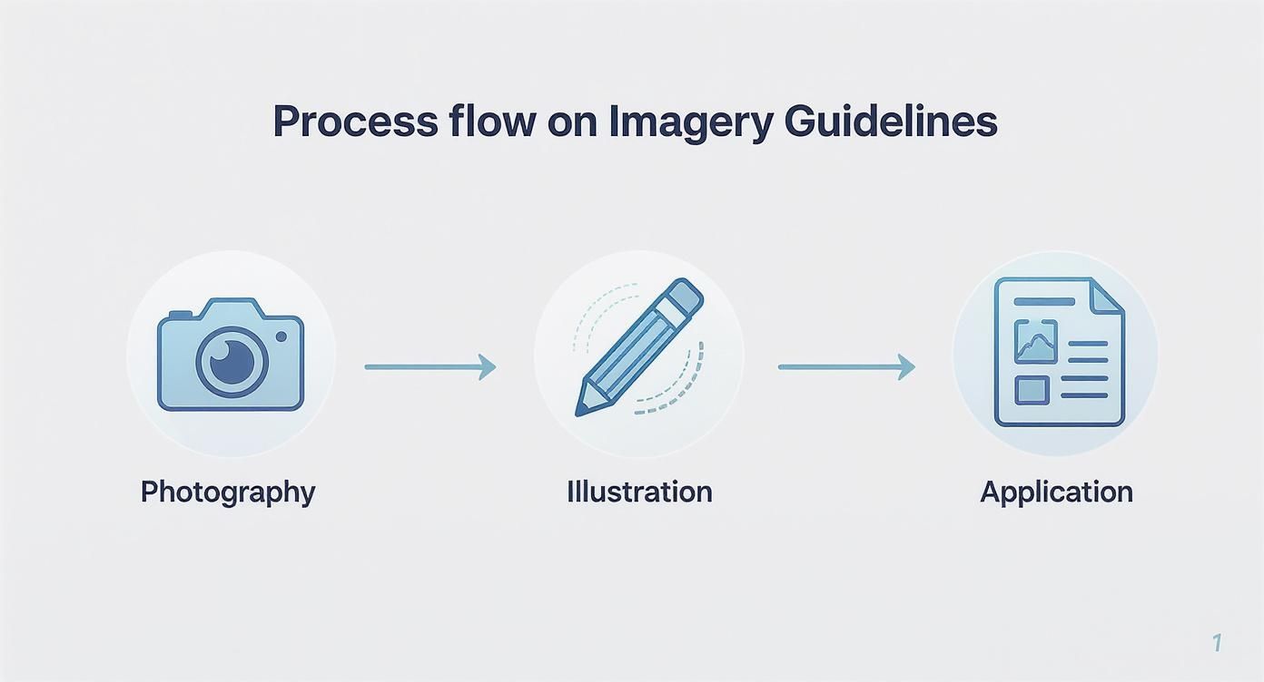
Visuals like this make the abstract rules feel more practical and easier to follow.
Run short, interactive training sessions for every department—not just marketing and design. Show real-world, before-and-after examples. Demonstrate how using the official templates actually makes their jobs easier. Make it engaging, and you’ll start creating brand champions across the business.
Set Up a Simple Governance Structure
To protect your brand’s consistency over the long haul, you need a lightweight governance process. This isn’t about creating bureaucracy; it’s about establishing clear ownership. Who is responsible for keeping things on track? Who signs off on new materials? Without this, consistency will inevitably slip as people come and go and the company evolves.
It's a shockingly common problem. Research in the UK found that while 95% of companies have brand guidelines, only a quarter of them actually enforce them. That lack of follow-through is why 71% of businesses admit that brand dilution confuses their customers. You can read more about these stats from Tenet.
Your governance model just needs to define three things:
- A Brand Guardian: Nominate a person or a small team to be the go-to expert for brand questions and approvals.
- A Review Process: Create a simple, quick workflow for new designs to get a final brand check before going public.
- An Update Schedule: Plan to review the guidelines annually. This keeps them relevant and ensures they grow with the business.
This simple structure turns your guidelines from a one-off project into a living, breathing tool that guides your brand into the future.
To help you get started, here's a simple checklist to guide your rollout plan.
Brand Guideline Rollout Checklist
| Phase | Key Action | Success Metric |
|---|---|---|
| Preparation | Finalise all guideline documents and create a central brand portal. | All assets are uploaded and the portal is live and tested. |
| Launch | Announce the new guidelines via a company-wide meeting or email. | 100% of staff notified of the new guidelines and portal location. |
| Training | Schedule and run department-specific training sessions. | 90%+ of relevant staff have attended a training session. |
| Integration | Update all existing internal and external templates (email, docs, etc.). | All old templates are archived and new ones are in use. |
| Reinforcement | Appoint a Brand Guardian and establish a clear review process. | A documented review process is shared with the team. |
| Maintenance | Schedule an annual review to update and evolve the guidelines. | Annual review date is set in the calendar. |
This checklist ensures you cover all the bases, moving from simply creating the guidelines to making them an integral part of how your business operates.
Got Questions? We've Got Answers
Even with the best intentions, a few common questions always pop up when creating and rolling out a new set of brand guidelines. Let's tackle the big ones head-on so you can finalise your brand book with confidence.
How Often Should We Update Our Brand Guidelines?
Think of your guidelines as a living, breathing part of your business, not a dusty rulebook. While a full-blown brand overhaul is rare, you should absolutely plan to review them at least annually , or anytime there's a major shift in the business.
Maybe you're launching a new product line, pivoting to a different audience, or going through a brand refresh. These are all perfect moments to revisit the guidelines.
Smaller tweaks can and should happen more often. You might need a new logo lock-up for a partnership or updated rules for a new social platform. The key is to keep the document relevant and useful. Don't let it gather digital dust and become ignored.
What's the Real Difference Between a Style Guide and Brand Guidelines?
People often use these terms interchangeably, but there's a subtle yet crucial difference.
- A style guide is very tactical. It's the "how-to" manual, focused on the nitty-gritty of design and writing. Think grammar rules, specific colour codes, and font sizes.
- Brand guidelines are much broader and more strategic. They contain everything a style guide does, but they're built on the foundation of your brand's purpose—your mission, vision, values, personality, and story.
In short, brand guidelines tell you the ‘why’ behind your identity. A style guide is all about the ‘how’ of putting it into practice.
Can We Create Decent Guidelines on a Small Business Budget?
Absolutely. You don't need a huge budget to create effective brand guidelines. The goal is consistency, not complexity. A startup or small business can make a huge impact with a simple guide covering the non-negotiables.
Your first version can be a straightforward PDF made with something like Canva or even Google Docs. Just make sure it clearly defines the essentials:
- Logo Usage: The basic dos and don'ts, clear space, and minimum size.
- Colour Palette: Your primary and secondary colours, complete with their HEX codes.
- Typography: The specific fonts for your headings and body copy.
- Brand Voice: A simple one-pager that sums up your personality and tone.
The real goal is to get those foundational rules down on paper from day one. You can always build on them as your business—and your budget—grows.
How Do We Get Our Team to Actually Use the Guidelines?
This is the final, and most important, hurdle. A brilliant document that nobody uses is worthless. Getting people on board is what makes or breaks your brand consistency.
First, make them ridiculously easy to find. A central brand portal or a clearly labelled folder on your shared drive is a must. Hiding it in an email chain is a recipe for failure. Make access effortless.
Second, give them a proper launch. Don't just send a memo and hope for the best. Run a training session, walk everyone through the document, and explain the why behind the rules. Show off some great examples of the brand in action to get people inspired.
Third, leadership has to walk the walk. When all comms and materials from the top are perfectly on-brand, it sends a powerful message.
And finally, make it easy for people to get it right. Provide pre-branded templates for presentations, social posts, and documents. When doing the right thing is the easiest option, compliance becomes second nature.
Crafting professional brand guidelines is a game-changer for building a strong, memorable brand. At Superhub , we specialise in helping businesses define their identity and create the powerful marketing assets they need to grow.
If you're ready to take your brand to the next level, explore our digital marketing services and see how we can help you make an impact.
Want This Done For You?
SuperHub helps UK brands with video, content, SEO and marketing that actually drives revenue. No vanity metrics. No bullsh*t.