
What Is Responsive Web Design? A Practical Guide for Your Website
Responsive web design is all about making a single website work beautifully on any device. It’s the magic that ensures your site looks sharp and functions flawlessly, whether it’s being viewed on a huge desktop monitor, a tablet, or a smartphone.
Understanding Responsive Web Design
Picture your website as being made of water. It can flow and perfectly fill any container you pour it into, big or small. That's the core idea behind responsive web design. It’s a modern approach where a site’s layout, content, and features dynamically adjust to fit the screen size of whoever is visiting.
This fluid way of thinking has become the gold standard for one simple reason: people have changed how they browse. We jump between all sorts of devices and expect a smooth, easy experience on every single one. Responsive design delivers this without the old, clunky method of building separate sites for mobile and desktop. Before this became the norm, businesses often had to maintain an awkward ‘m.website.co.uk’ version, which was expensive, inefficient, and a pain to manage.
Responsive design isn’t a nice-to-have feature any more; it’s a fundamental requirement for any serious website. It makes sure every visitor gets the best possible version of your site, which directly shapes how they see your brand.
The Core Idea Behind Responsiveness
The goal is simple: create one website that works for everyone.
This means whether someone is on a high-resolution laptop or a small smartphone, your site should be effortless to read, navigate, and use. Key elements include:
- Readability: Text automatically resizes so it’s legible without any awkward pinching and zooming.
- Navigation: Menus and buttons transform to be easy to tap on touchscreens.
- Visual Integrity: Images and videos scale down correctly without distorting or breaking the page layout.
To help you get a quick overview of how these principles translate into real-world benefits, we've put together a simple table.
Responsive Design at a Glance
Here’s a snapshot of the core principles of responsive design and the tangible benefits they deliver for your business.
| Core Principle | What It Means for Your Website | Key Business Benefit |
|---|---|---|
| Fluid Grids | The site’s layout uses flexible percentages instead of fixed pixels, allowing it to stretch or shrink gracefully. | A consistent, professional look across all devices, strengthening brand perception. |
| Flexible Media | Images and videos automatically resize to fit within their container, preventing them from overflowing or looking distorted. | A better user experience, which keeps visitors on your site longer and reduces bounce rates. |
| Media Queries | Special CSS code detects the screen size and applies different style rules, optimising the layout for that specific device. | Improved SEO rankings, as search engines like Google prioritise mobile-friendly websites. |
This table shows that responsive design isn't just a technical task; it's a strategic decision that directly affects user experience, brand credibility, and your bottom line.
Knowing the different roles involved, like the difference between a web designer vs web developer , can clear up who handles what. Ultimately, getting responsiveness right is a huge part of building a successful online presence. You can dive deeper into the whole process in our guide on the 8 things you need to know about website development before you start.
The Three Pillars of Responsive Web Design
To really get what responsive web design is, it helps to look under the bonnet at its three core ingredients. These are the technologies that work together to create that seamless, fluid experience we all expect, no matter what screen we’re using. Think of them as the essential building blocks that let a single website cleverly adapt to countless device sizes.
The first pillar is the fluid grid . Picture this as your website’s flexible skeleton. Instead of using rigid, fixed measurements like pixels, a fluid grid uses relative units like percentages. This means columns and containers are defined by how much space they take up relative to the screen, allowing them to stretch or shrink in perfect harmony as the viewing area changes.
This simple idea is what stops that awkward horizontal scrolling you see on poorly designed mobile sites, ensuring the core layout always feels right.
Making Media Flexible
With a flexible skeleton in place, the next challenge is making sure everything inside it behaves. This is where flexible media comes in. Images, videos, and other media are told to resize themselves to fit neatly within their containers. It’s a simple but powerful rule that stops a huge image from ‘breaking’ the layout on a smaller screen.
It ensures your visual content scales down gracefully, keeping its aspect ratio and impact without wrecking the user’s experience. The end result? A site where everything just fits , whatever the device.
This concept map shows how a single website design branches out to serve different devices—the core goal of responsive design.
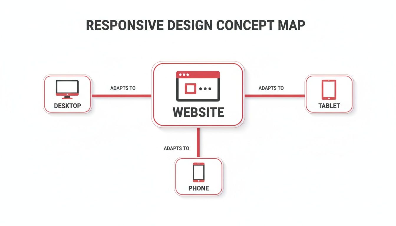
The key takeaway here is that one central design has to be smart enough to change its presentation for desktops, tablets, and phones.
The Brains of the Operation: Media Queries
The final and arguably most important pillar is the media query . If the fluid grid is the skeleton and flexible media is the content, then media queries are the brain. These are clever little filters in the website’s code (CSS) that check for specific conditions, most often the width of the device’s screen.
A media query essentially asks the browser: "How wide is the screen you're using?" Based on the answer, it applies a specific set of style rules tailor-made for that size.
For example, a media query can tell the browser to do things like this:
- On a wide desktop screen: Show a three-column layout with a big, expansive navigation bar.
- On a tablet screen: Switch things up to a two-column layout and use slightly smaller text.
- On a smartphone screen: Stack all the content into a single, scrollable column and change the navigation into that familiar 'hamburger' menu icon.
These three pillars—fluid grids, flexible media, and media queries—all work together to deliver a consistent and genuinely optimised experience. Mastering these fundamentals is the key to creating a website that puts the user first. To learn more about how this affects your visitors, you should read our guide to master user experience design principles for better UX.
Responsive Design vs Adaptive Design: Understanding the Difference
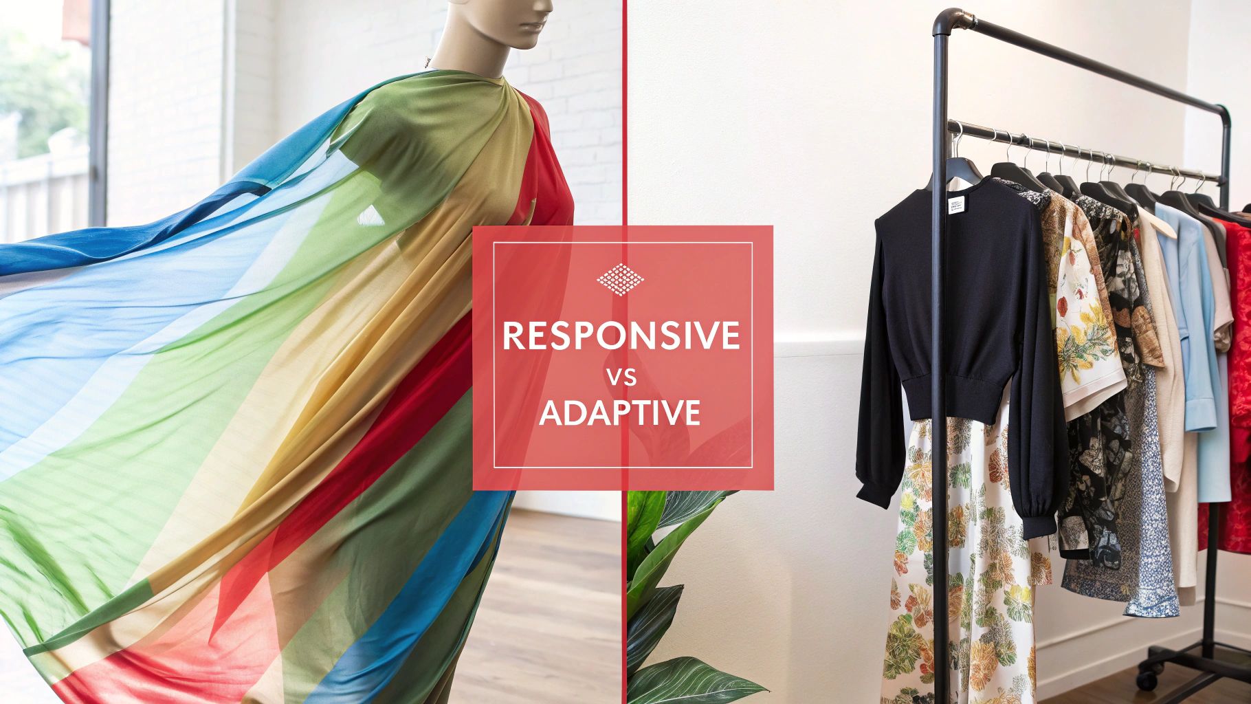
As you dig into responsive web design, you’ll almost certainly bump into another term: adaptive web design . It’s easy to mix them up. After all, they both try to give users a great experience, no matter the device.
But the way they get there is completely different. Getting this distinction right is crucial for any business owner planning a web project, because the choice you make affects everything from your budget to your site's performance.
Let's use an analogy to make it stick.
Think of responsive design as a single, fluid outfit made from a kind of magic, stretchy fabric. It automatically adjusts to fit anyone who wears it perfectly, whether they're big or small. It’s one design that just flexes and reshapes itself to whatever space it’s given.
On the other hand, adaptive design is like having a wardrobe with a few distinct outfits —one for small, one for medium, and one for large. Instead of stretching, the system just figures out the person's size and hands them the right pre-made outfit. It's less about fluidity and more about serving up a fixed layout that best matches a specific screen size.
Key Differences at a Glance
This core difference creates very real, practical distinctions in how each type of site is built and looked after. A responsive site runs on a single codebase that works everywhere. An adaptive site, however, needs you to create and manage several separate layouts for different "breakpoints," or screen widths.
The real split is in how they react to the screen. A responsive site smoothly adjusts to any screen size it encounters, while an adaptive site just snaps to the closest pre-defined layout it has in its collection.
This becomes crystal clear when you put them head-to-head.
Responsive vs Adaptive Design: A Head-to-Head Comparison
The table below breaks down the key differences between these two approaches, looking at everything from their methodology and flexibility to what it takes to maintain them.
| Feature | Responsive Web Design (RWD) | Adaptive Web Design (AWD) |
|---|---|---|
| Flexibility | Highly flexible and fluid. The layout continuously adjusts to any screen width, ensuring a seamless look on all devices. | Less flexible. The site loads one of several fixed layouts designed for specific screen sizes (e.g., mobile, tablet, desktop). |
| Development | Simpler to maintain with a single codebase. All changes are made in one place and apply across all devices. | More complex upfront. Developers must create and test multiple distinct layouts for different breakpoints. |
| Performance | Can sometimes be slower on mobile as the full site code is loaded, then adjusted by the browser. | Can offer faster load times on mobile as only the assets for that specific layout are delivered to the device. |
| Best For | The modern standard for most websites, offering excellent consistency and future-proofing against new device sizes. | Niche applications where a highly tailored, optimised experience for specific devices is the top priority. |
For the vast majority of businesses today, responsive design is the way to go. Its simplicity and consistency just make more sense.
Why Responsive Design Is Critical for Business Success
Getting your head around the how of responsive design is one thing. But truly understanding its direct impact on your bottom line? That’s something else entirely. A responsive website is no longer a 'nice-to-have' technical feature; it's a core commercial asset that's essential for growth, especially in a competitive UK market where your customers are glued to their phones.
If you don't have a responsive site, you're actively turning people away. Forcing visitors to pinch, zoom, and wrestle with your navigation on their phone is a recipe for frustration. It sends them straight to your competitors, and it's a direct hit to your potential revenue.
Boost Your Visibility with Better SEO
If you care about showing up on Google, responsive design is non-negotiable. It’s all down to something called mobile-first indexing . In simple terms, Google now primarily looks at the mobile version of your website to decide how to rank you for everyone.
That means if your site is clunky and difficult to use on a smartphone, your rankings will suffer everywhere, even on desktops. A slick, mobile-friendly website is now a fundamental ticket to the game for getting and keeping your search visibility.
Bottom line: Google rewards websites that give people a great experience. A responsive design tells them your site is high-quality and user-focused—exactly what search engines want to show their users.
Drive More Conversions and Sales
A smooth user journey leads directly to better conversion rates. It’s simple, really. When a potential customer can easily browse products, read about your services, or fill out a form on their phone or tablet, there’s nothing getting in the way of a sale. For UK e-commerce in particular, a seamless mobile experience isn't a bonus; it’s an absolute expectation.
The data doesn’t lie. Here in the UK, responsive designs can deliver 11% higher conversion rates and 20% more user engagement . Those numbers are huge, especially when you consider that 83% of mobile users demand a flawless experience across all their devices. If this is a weak spot for you, our team has broken down several reasons why your website isn't converting and how to fix it.
Simplify Maintenance and Reduce Costs
Beyond the immediate wins with customers and SEO, responsive design just makes good business sense from an operational perspective. Think about the old way of doing things: maintaining two separate websites, one for desktop and one for mobile. It’s a logistical nightmare.
- Double the work: Every single update—whether it's content, a security patch, or a design tweak—has to be done twice.
- Increased costs: You're literally paying for the development and upkeep of two separate digital properties.
- Risk of inconsistency: It’s incredibly difficult to keep your branding and messaging aligned across two different versions.
A single responsive website streamlines everything. You manage one site, one set of content, and one marketing strategy. It saves a huge amount of time, money, and administrative headaches in the long run.
How to Implement and Test Your Responsive Design
So, you’re sold on the theory. But how do you actually put responsive design into practice? It all starts with a simple but powerful shift in mindset before you even think about code. The strategy that’s become the gold standard is the mobile-first approach .
It does exactly what it says on the tin. Instead of building a massive, complex desktop website and then desperately trying to cram it onto a small screen, you start the other way around. You design for the mobile phone first. This forces you to be ruthless, to focus only on what’s absolutely essential for your user. The result is a cleaner, faster, and more focused experience for everyone, regardless of their device.
The old way, sometimes called 'graceful degradation', meant starting big and cutting things away. More often than not, this left mobile users with a bloated, slow, and frustrating version of the desktop site.
For those looking to get a head start, frameworks like Bootstrap offer ready-made responsive building blocks. And if you’re using a platform like Elementor, diving into responsive design best practices will give you a clear roadmap for making sure your site shines on every screen.
Choosing Your Implementation Strategy
The mobile-first method isn't just a trend; it's now widely seen as the only way to build a modern website. By focusing on the core experience for mobile users, you build on a solid, lightweight foundation. From there, you can progressively enhance the design for tablets and desktops, adding richer features and more complex layouts as you get more screen space to play with.
This approach isn't just good design—it's smart business. It aligns perfectly with how people actually browse the internet today and what search engines like Google want to see. With the UK’s incredibly high mobile internet usage, it’s no surprise that businesses with responsive sites see a tangible payoff. Studies have shown they can achieve 22% lower bounce rates and an impressive 24% higher mobile conversion rates . That's a serious competitive edge.
A Practical Checklist for Testing
Once your site is built, the job isn't over. You have to test it. And I mean really test it. The good news is you don’t need a fancy lab full of expensive gadgets to get started. Your web browser’s built-in developer tools are surprisingly powerful. Just right-click on your site, hit "Inspect," and you can instantly see how it looks on dozens of different screen sizes.
Here’s a quick and dirty checklist to run through:
- Layout & Readability: Is the text legible without having to pinch and zoom? Does all the content stack neatly into a single column on mobile, or are you getting that dreaded horizontal scrollbar?
- Navigation & Buttons: Does your main menu collapse into a clean, easy-to-use "hamburger" icon? More importantly, are buttons and links big enough for a thumb to tap easily? Make sure there's enough space between them to prevent accidental clicks.
- Media Performance: Do your images and videos resize properly without looking stretched or breaking the page layout? A crucial one: are they optimised to load fast, even on a patchy 4G connection?
- Form Functionality: Try filling out a contact form on a phone. Is it a nightmare? Make sure the on-screen keyboard doesn't cover up the fields you're trying to type in.
Running through these basic checks can uncover glaring usability problems before your customers do. It gives you concrete feedback to take back to your web developer, ensuring the final site doesn't just look responsive, but truly feels responsive.
A Few Final Questions Answered
As you start to think about what responsive design really means for your business, a few practical questions always pop up. It's completely normal. To wrap things up, we've answered some of the most common queries we hear from business owners.
Think of this as your quick-fire guide to get the last few pieces of the puzzle sorted.
How Much Does a Responsive Website Cost in the UK?
The price of a responsive website in the UK can swing quite a bit depending on what you need it to do. For a simple, professional "brochure-style" site, you might be looking at a starting point between £2,000 to £5,000 . If you need something more complex, like an e-commerce shop or a site with custom-built features, that range could easily go from £5,000 to £25,000 and beyond.
The crucial thing to grasp is that responsive design isn't an optional "extra" any more—it’s the standard. It’s baked into any modern, professional web build. This one investment actually saves you a fortune in the long run, because you don’t need to build and maintain a separate mobile site, which would effectively double your costs and workload. Always get a detailed quote that spells out exactly what’s included.
Will Google Penalise My Website If It’s Not Responsive?
Yes, absolutely. Google now operates on 'mobile-first indexing' . In simple terms, this means Google’s search bots primarily look at the mobile version of your site to decide how to rank it. If your site is a broken, frustrating mess on a phone, your search rankings will take a nosedive everywhere.
In today's market, a non-responsive website is a huge SEO liability. It makes you practically invisible to the enormous number of potential customers searching for what you offer on their smartphones.
Is a 'Mobile-First' Approach Always Best?
For any new website, taking a 'mobile-first' approach is almost always the smartest way to go. It’s a design philosophy that forces you to focus on what’s truly essential from the get-go. This discipline leads to a cleaner, faster, and more user-friendly experience on all devices, not just mobile. You’re building a stronger, leaner foundation from the ground up.
The old way, 'graceful degradation' (designing for a big desktop screen first and then trying to shrink it down), often leads to cluttered and slow mobile sites. Features get clumsily chopped off rather than being thoughtfully included from the start.
Can I Make My Old Website Responsive?
That really hinges on how the site was built in the first place. If it’s sitting on an old, inflexible platform, trying to bolt on responsiveness is like renovating a house with dodgy foundations—it often ends up being more expensive and causing more headaches than just starting fresh.
But if your site is built on a modern Content Management System (CMS) like WordPress , it might just be a case of swapping to a responsive theme or having a developer rework the code. The best way forward is to get a professional web assessment. An expert can look under the bonnet and give you honest advice on whether a tune-up or a full rebuild is the more sensible option, both financially and technically.
At Superhub , we build stunning, high-performance responsive websites that are designed to grow your business. If you’re ready to give every visitor a flawless experience, no matter the device, our team is here to make it happen. Get in touch with us today to talk about your project.
Want This Done For You?
SuperHub helps UK brands with video, content, SEO and marketing that actually drives revenue. No vanity metrics. No bullsh*t.